Abstract. Using data collected with an infrared camera, a mean external temperature for any given building can be found and subsequently compared to that of other buildings or the building’s own internal temperature. This data gives a statistical basis for determining the heat efficiency of a building.
Introduction
With the current pushes to maintain a green campus and common complaints about certain buildings’ inconsistency in temperature, we decided that we would find a way to explore just how much heat was lost by each building. The Physics Department already had a FLUKE Ti45 in its possession, leading to the simple conclusion that we could just point the infrared camera at the buildings and see how hot the outsides were compared to the background temperature. So as to reduce the amount of people that would interfere with our numbers and increase the contrast between the buildings and the outside temperature, the study was conducted over the course of January 2016. Due to the constraints of the equipment, measurements could only be taken when the air temperature was greater than 14°F, as such it was decided that the data should be collected with a background temperature of 22°F. We collected data on six buildings: North Hall, South Hall, Centennial Science Hall, the University Center, James H. Ames Suites, and Prucha Hall.
Methodology
In order to collect consistent data from building to building, images were taken of each building in a manner that would attempt to cover the most amount of the outside of the building while reducing overlap. This style is admittedly imperfect and could contribute too many errors in the data.
Once the data was collected from the camera, it was organized into folders by building. The camera recorded data as .is2 files (which are fairly standards among infrared cameras) that we opened using Fluke’s SmartView 3.11. Once opened in this program the images can be centered over the visible color images that the Ti45 also recorded, and the spectrum used to display temperature was standardized. For all images in this project we used the High Contrast settings, with the minimum set to 16°F and the maximum to 70°F (this only effects the coloration of the photos, not the collected data). Once the images are standardized were then be exported in bulk as .csv files, which are all then saved in the same folders as the pictures
The analysis of this data was done using Origin 2016. To begin with, we imported all the .csv files from a particular building. In each of these files, which are then considered worksheets within Origin, we removed the header data. This data is used to define the position of each pixel, which we did not use as part of our analysis. Each worksheet’s columns were then stacked, creating a single column worksheet. All of these worksheets were then appended together (selecting only column B(Y) in the appending dialog), and this resulting worksheet’s columns then stacked as well.
This single column worksheet is what we considered our data set. A histogram could be made from this set at this point, which is what we considered the “complete” data. However, this data included quite a few points from the background of the pictures, which created a noticeable bump on the histogram. This means that there were two bumps on a complete data histogram: the first being around the mean background temperature, the second being the mean temperature of the building itself. To focus the results and find a statistical mean, we truncated all the data in the column below a specific temperature. We chose 26°F as the standard cutoff point, in most of the histograms we saw early on, this was the point at which the first bump ended and the second began. Histograms that this was done to are labeled “Truncated below 26°F” (some graphs may have used a different cutoff point and are labeled respectively). A normal curve fit was applied to these histograms to visualize their general spread.
Results
For each building we compiled the truncated data into a histogram with a bin size automated by Origin (typically 2°F). We also calculated means and standard deviations of the truncated data. We can then use these values to graph a normal curve for each building, which is then plotted over the respective histogram. To create a readable comparison between each of the buildings, these normal curves can be graphed together, as seen in Figure 1.
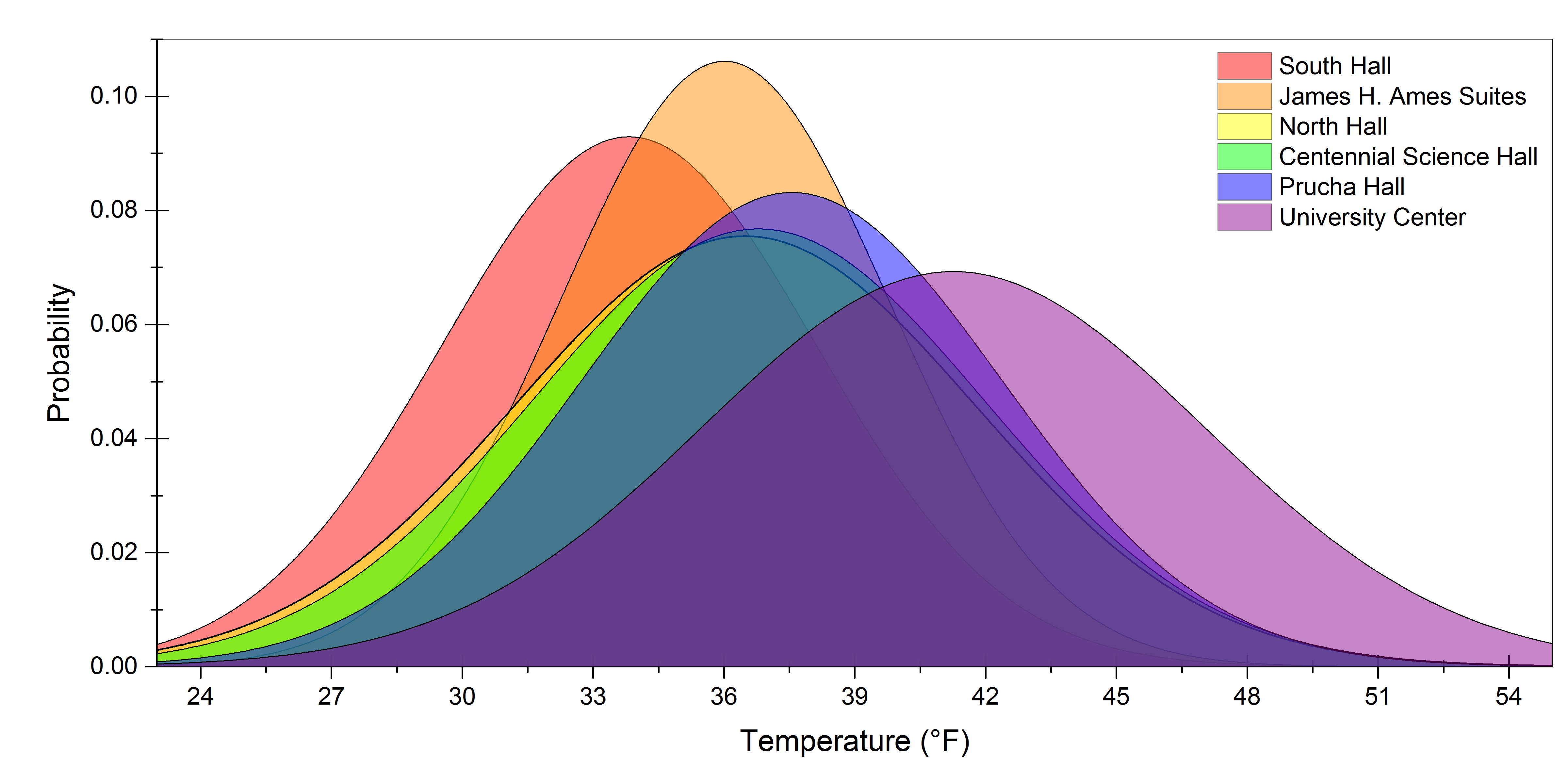
FIGURE 1. The normal curves derived from the data collected from each building graphed atop each other to give a general idea of how each building’s temperature compares. The probability here represents the percentage of points (after truncations) in the data that measured a given temperature.
The amount of pictures taken varies significantly by building, this is mainly due to the size and complexity of each structure. As such, knowing the amount of images could be useful in interpreting the data collected. This could possibly be used to calculate an uncertainty value on the measured temperatures, but for our purposes we will simply be using an estimate made by comparing the variations in the surrounding air temperature. The statistics for the data collected from each building are in Table 1.
| Building | Number of Points | Truncation Point | Mean | Std Dev |
|---|---|---|---|---|
| North Hall | 435,309 | 26,692 | 36.5°F | 5.3°F |
| South Hall | 188,896 | 22,305 | 33.8°F | 4.3°F |
| Centennial Science Hall | 854,305 | 9,576 | 36.8°F | 5.2°F |
| University Center | 528,715 | 28,086 | 41.3°F | 5.8°F |
| James H. Ames Suites | 359,401 | 5,400 | 36.0°F | 3.8°F |
| Prucha Hall | 123.354 | 30,247 | 37.6°F | 4.8°F |
TABLE 1. The number of points in this table is the amount of pixels collected from each picture of a given building; the truncation point is then the amount of points removed when clearing out the background of the images.
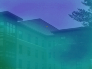
North Hall
We began the data collection with North Hall due to the simplicity of the building’s layout, which can be approximated as a rectangle. This was also the building whose internal temperature inconsistency inspired this project. To give a decent overlook of the building’s data, we can use the histogram created from the combination of all its images, as seen here in Figure 2.
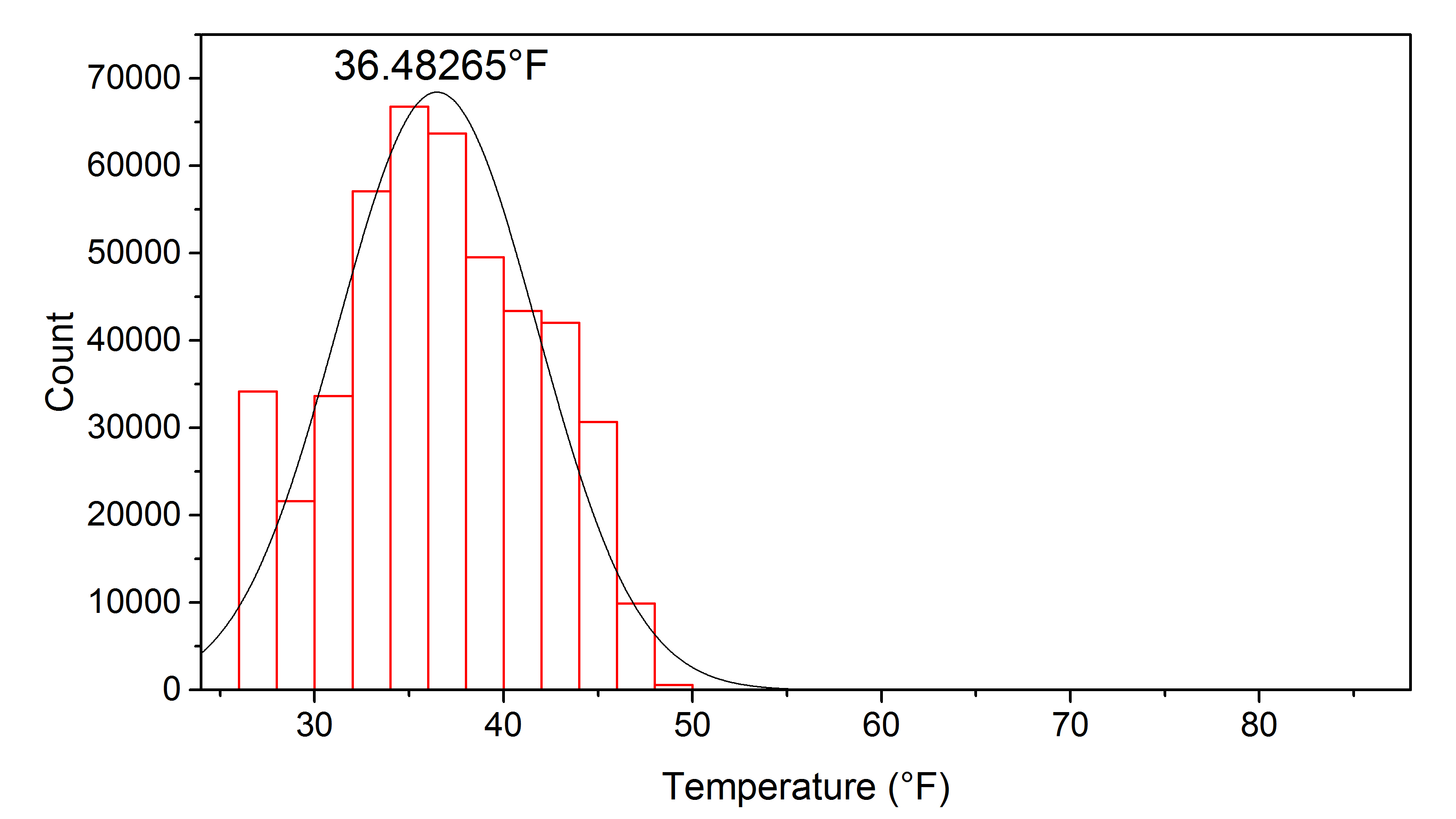
FIGURE 2. A histogram of North Hall’s data after all points below 26°F were removed. The number atop the normal curve denotes the value of the mean. The scale would appear unintuitive due to dead pixels on the IR camera recording significantly higher temperatures than the actual value.
 |
 |
|---|---|
| (a) | (b) |
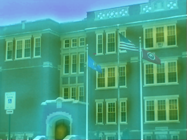
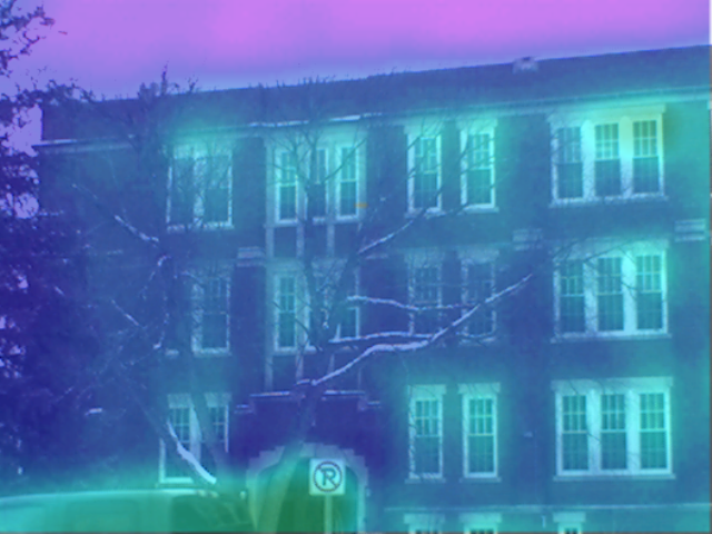
FIGURE 3. As a general comparison of what factors contributed to the data, we can compare an image of the west side of North Hall (a) with one from the east (b). The east appears much more crowded and cool, whereas the more open area on the west side appears much warmer, including the noticeable area of the background air.
Given that the air temperature at the time was approximately 24°F, we find a difference of 12.5°F between the air and the building’s mean temperature. We could not determine any usable control measurements for this data. However, this data can be compared to that of other buildings or used to analyze specific locations on the building.
When measuring temperature using infrared, it is paramount to note the amount of interference we can get from the area surrounding the building we want to measure. Much of this interference can be attributed to the inherent properties of heat, whereas taking measurements in a warmer area will make whatever is being measured look warmer. This effect is quite noticeable for buildings, such as North Hall, whose sides are in different types of environments, as seen in Figure 3. The west side of the building is facing a large, open parking lot, with a lot of exposure to the sun and surrounding environment. On the other hand, the east side faces a much smaller lot, decorated with tree and otherwise surrounded by a residential area where it would be exposed to light and heat much less.
South Hall
The next building to be measured was South Hall, which is directly across the street from North Hall. South Hall ended up having the lowest mean temperature of the six buildings that we measured. It should also be noted that this building had the second least amount of data measured. Figure 4 contains a histogram of all the images collected of South Hall after truncation.
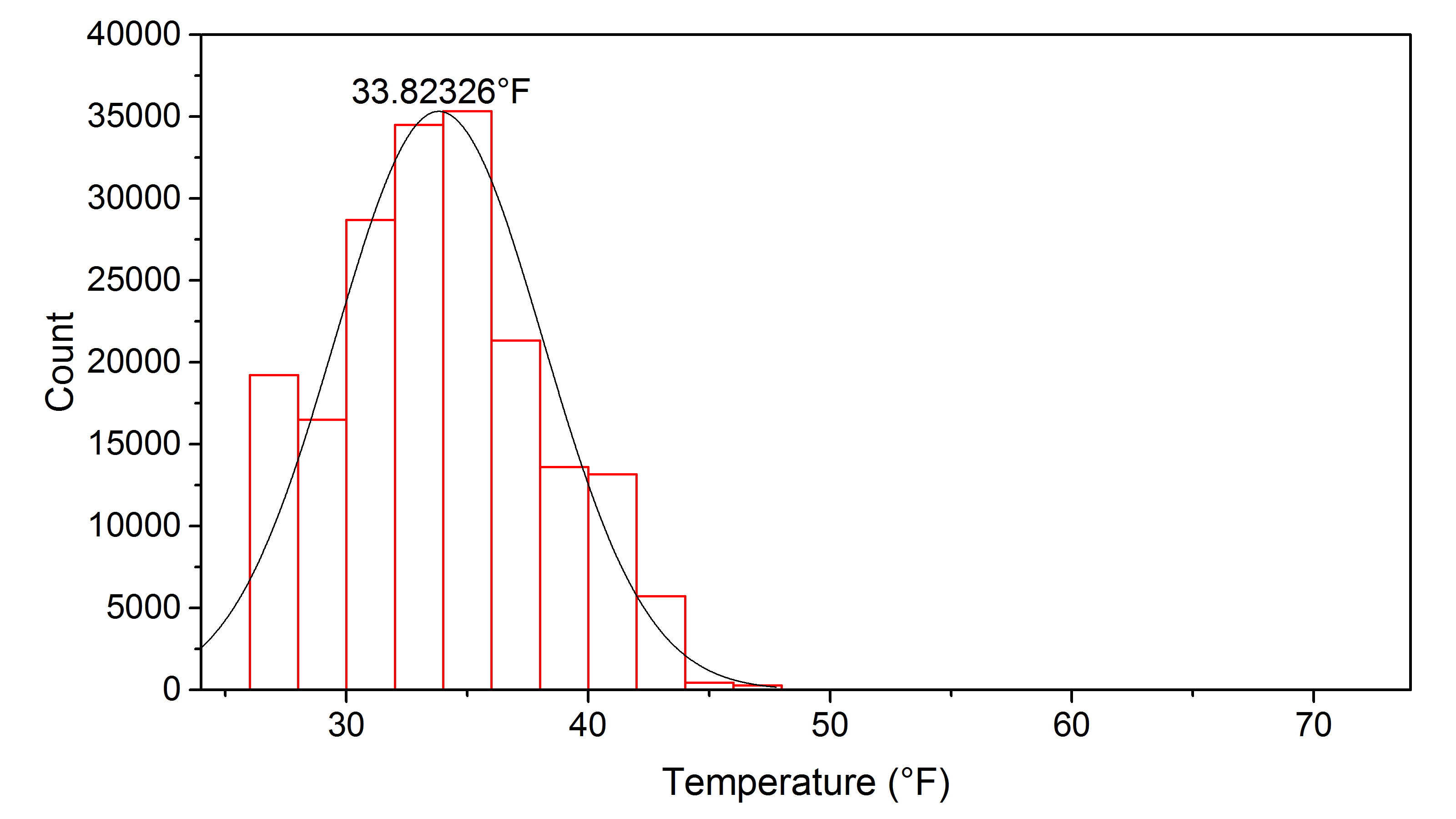
Figure 4. A histogram of South Hall’s data after all point below 26°F were removed. Again the mean temperature is listed above the peak and the scale is skewed to the right due to the dead pixels.
From our data giving a mean temperature of 33.82°F and the reading of the temperature of the air being recorded at 24°F, we found a difference of 9.8°F. Again it should be stressed that keeping the picture as clear of foliage and other obstacles is paramount to getting accurate results of the building’s heat emission.
Centennial Science Hall
Continuing off of South Hall we have Centennial Science Hall (CSH) which is towards the middle of campus just North East of the University Center. CSH had the lowest number of truncated data points and the highest number of total data points, this gives us the highest number of usable points for a building. This was due to the size of the building and the odd shape compounded with having photos taken at a closer distance than the rest of the buildings.
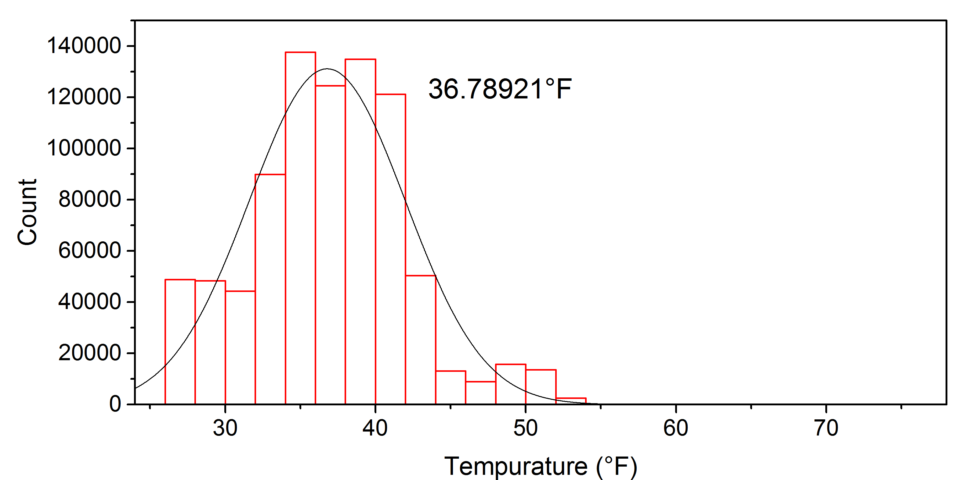
FIGURE 5. A histogram of CSH’s data with all the points below 26°F removed, again most of the skewing of the scale is from the dead pixels but more of the skew is from actual data points than the previous buildings.
From our data we got a mean temperature of 36.79°F and the recorded air temperature being 22°F giving a difference of 14.79°F. Here we start to see the patterns of heat loss from windows and heat vents both of which are expected but they do emit a significant amount of heat that can be used to keep the building warm for longer.
University Center
For the largest building we measured we looked at the newest building, the University Center (UC). A building that was built with the premise of being ecofriendly while being functional. Some points that should be made before showing any results are that the UC was measured during late January, a time when the University is preparing for the Spring semester to start and thus opening the main building on campus to people and use again.
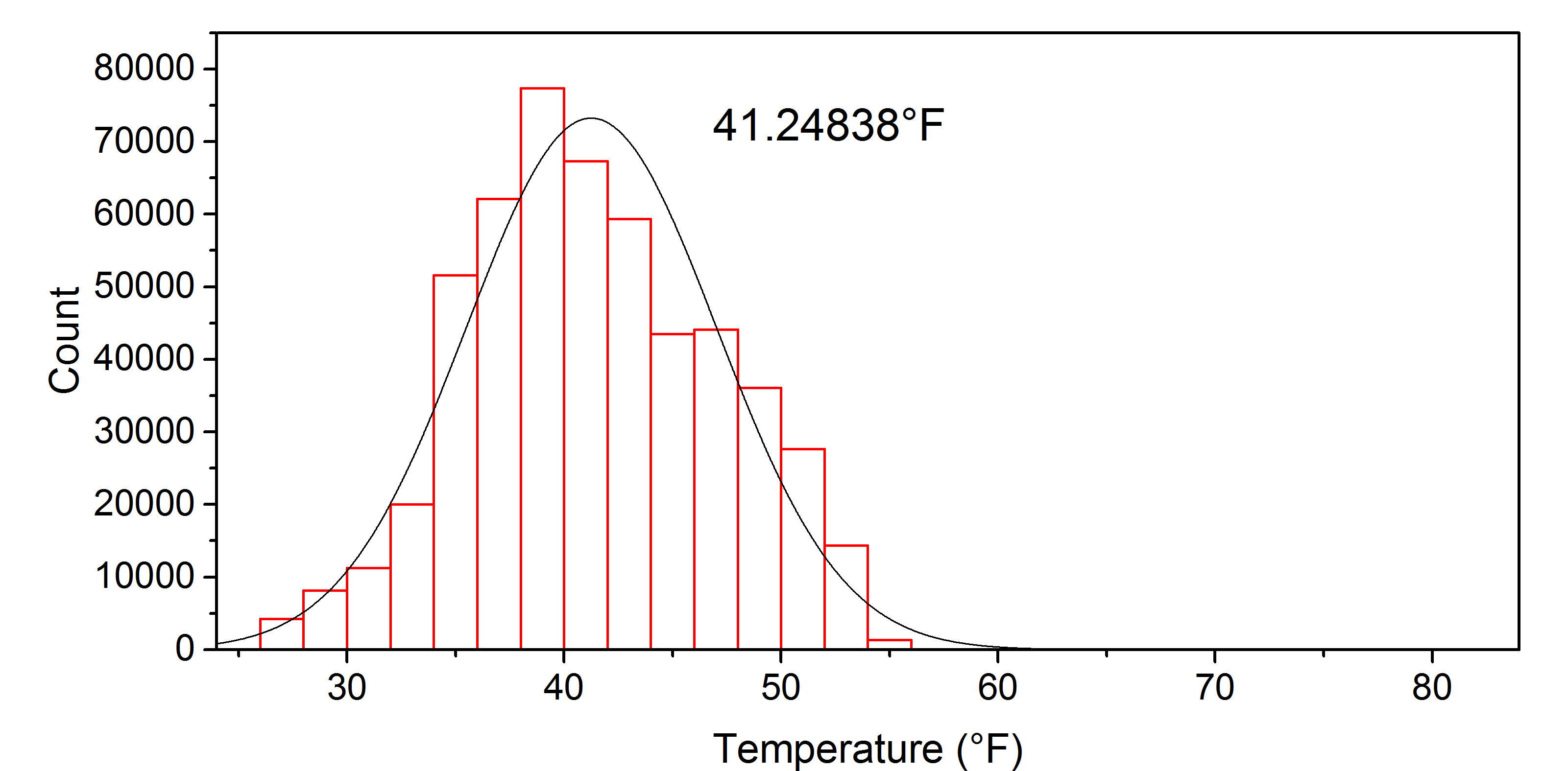
FIGURE 6. A histogram of the University Center’s data with all points below 26°F removed, the skewing of this graph represents the data well since there were points in the upper 70°s.
From our data we got a mean temperature of 41.25°F and a recorded air temperature of 22°F with a difference of 19.25°F. The University Center exemplifies the use of windows and how they affect heat loss and absorb sunlight and its energy. The UC also showcases the amount of heat expelled through heat vents, this gives a better indication as to what a fully functioning building on campus will look like during the winter months, compared to the hibernating buildings such as James H. Ames Suites and Prucha Hall over J-Term.
James H. Ames Suites
One of the newer buildings on campus, James H. Ames Suites (Ames) is similar to the UC in being a green building. The time the measurement was taken was during the middle of J-Term when few if any residents were staying inside, this allows us to showcase what a hibernating building during J-Term will look like in terms of heat efficiency. Overall this was the most consistent building as seen by the relatively small standard deviation.
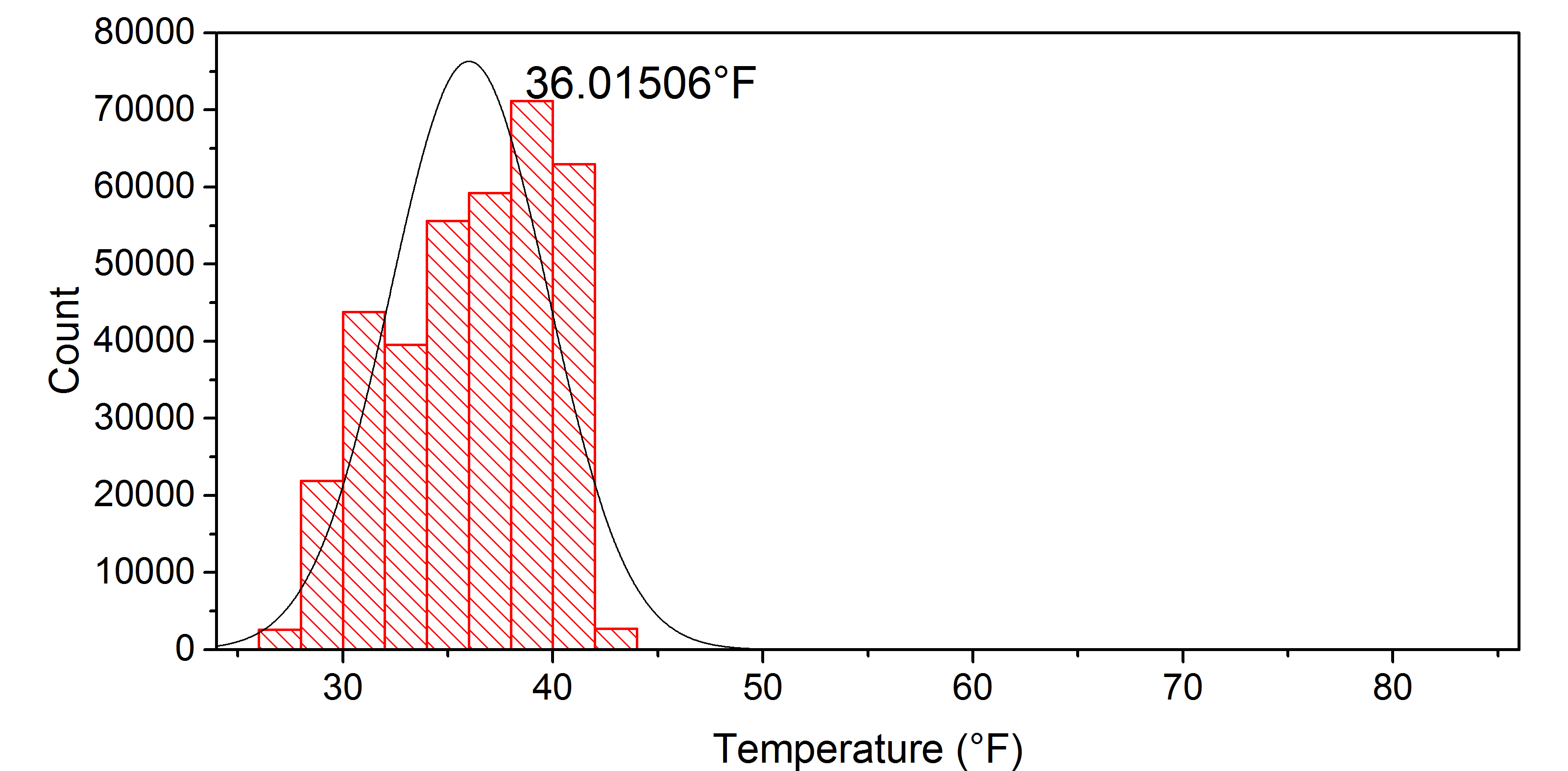
FIGURE 7. A histogram of Ames with all points below 26°F removed, overall a tighter Gaussian distribution than the other buildings with the same skewing due to the dead pixels.
 |
 |
|---|---|
| (a) | (b) |
FIGURE 8. The figure above shows the relative uniformity to Ames (a) and how there is still some variation as seen in (b). This overall trend can be seen in other hibernating buildings around campus.
From our data we got a mean temperature of 36.02°F and a recorded air temperature of 22°F with a difference of 14.02°F. Ames showed a similar construction style to the UC and it had heat loss in similar areas, with large bays of windows pointed southwest to let sunlight inside. Over all Ames was the quieter of the two hibernating buildings measured which can be partially attributed to the time when it was measured.
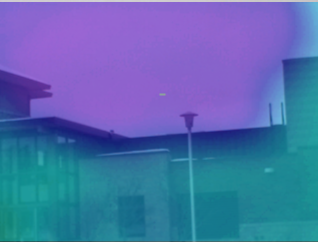
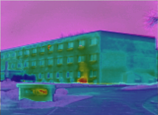
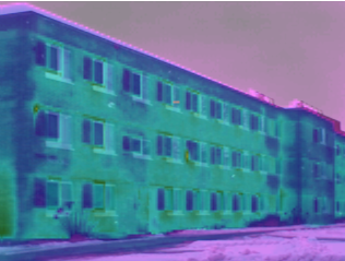
Prucha Hall
Prucha Hall (Prucha) is one of the more classic style dormitories on campus, because of this we can approximate it to most of the dorms found on the west side of campus (Johnson, Stratton, and May Hall). The time that Prucha was measured was the same day as the UC and thus was being warmed up for use again.
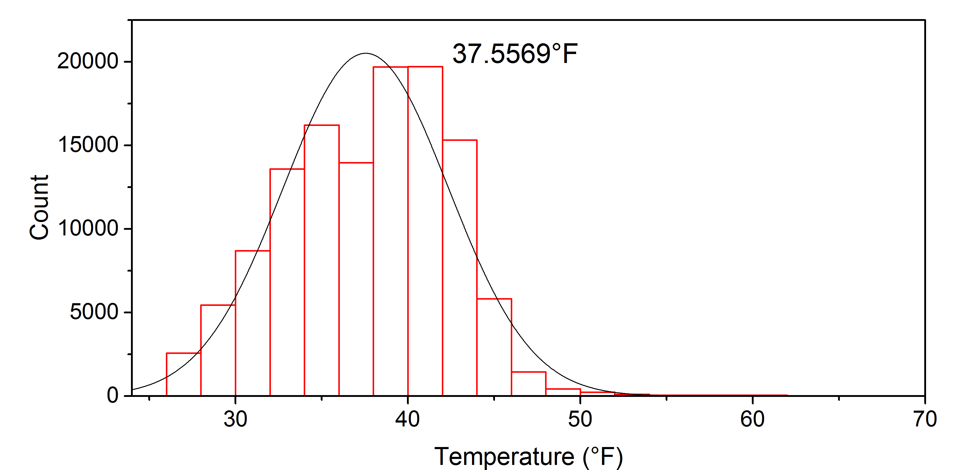
FIGURE 9. A histogram of Prucha with all data points below 26°F removed, with an accurate scale since there were some higher temperatures near the level that the dead pixels were registering at.
 |
 |
|---|---|
| (a) | (b) |
FIGURE 10. Photo (a) shows the massive heat loss from a heat vent and a window on the top floor along with the heat escaping a steam tunnel. Photo (b) shows the heat loss from the North windows is fairly low compared to the South windows.
From our data we got a mean temperature of 37.56°F and a measured air temperature of 22°F which is a difference of 15.56°F. This ended up being the second hottest building measured, some of which can be attributed to the contamination of the steam tunnel access portal and the rest from poor insulation in the walls. Given how the walls on most of the building ended up being a greenish blue to dark green, compared to the darker blues and purples of the surrounding environment, this is pretty obvious to being an insulation issue from the original construction.
Discussion
This method of collection and analysis does not give us any concrete conclusion as to the efficiency of each building. We merely gain a simple comparison between the amounts of heat lost, and a few noticeable areas of larger heat loss. Theoretically, this data could be compared to the energy and heating costs of each building to find some coefficient that would be indicative of said building’s efficiency.
Another way by which this research may be expanded may be to do the same study on all of the buildings on campus, and perhaps eventually to do so with other campuses. This, of course, would be much more reasonable to carry out if such a coefficient for the efficiency is found. It would also help the study if a more efficient means of analyzing the data is found, such as a program that can stitch all the photos taken into one.