After much consideration of different manners of creating a design for the People’s Virtual Front that would represent the intent of the project as a whole, I had the idea of attempting to create a hammer and sickle with lines and circular terminals to give the appearance of a printed circuit board. While I do agree that to some extent the hammer and sickle is overused, the goal of this project is to provide a platform for informative content about leftist thought, particularly in video format, and so it may be preferable to in some way use common communist symbolism to represent this. Of course, the hammer and sickle does have a reputation of being associated with the U.S.S.R., the policies and ideologies of which many members and viewers of this project may significantly disagree with; the hope is that the representation of the symbol with a circuit design will serve as a powerful enough obfuscation of the symbol such that viewers will not immediately assume the intent to defend the U.S.S.R. (if this does come up at any point, members of the project are free to denounce any associations with the U.S.S.R., Russia, Marxism-Leninism, etc. and bring the issue back to the group as a whole to reassess the necessity of a redesign). In general, I do not believe that it is necessary that the logo be 100% original, or that we should avoid Soviet symbolism completely. Other leftist symbolism also has its associations with unfavorable groups and other generally negative perceptions, a lot of these, however, do not lend themselves as easily to manipulation due to either the basic structure of the symbol or the lack of variation in the past so as to not set enough precedent that people will be looking to recognize it in various forms.
“Things which are different in order to be different are seldom better, but that which is made to be better is almost always different.” — Dieter Rams
I believe the pursuit of a wholly original design will not create as decent of designs as the pursuit of cohesive, high-quality design itself, and so I did not concern myself with the unoriginality of the usage of the hammer and sickle.
Base Design
![]()
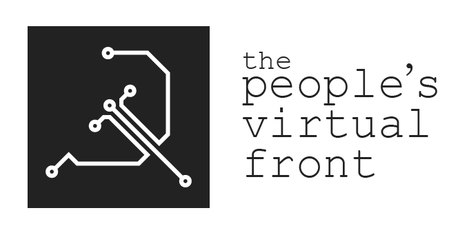
The basis of the design is the circuity hammer and sickle. This logo has a very high density of detail and so cannot be placed too closely to other elements at risk of making the entire design appear chaotic. This is partially remedied by the containment of the logo in a dark-gray box, the particular color of this box being #222, which is dark enough to appear almost black without being so dark as to give a harsh tone to the design. The remaining issue with the usage of this design is that it is based heavily on concepts of line art, meaning that it is difficult to scale down past a certain point and that its placement next to text may face certain issues with the perceived inconsistencies between the line widths in the logo itself and those of the font used.
Usage with Text
To keep with the theme of electronics in the design, Courier New is the best font to use alongside the logo. As this is a fixed-width font, there are a couple issues related to the typesetting.

First, the usage of the word “the” before “People’s Virtual Front” has either the issue that it would significantly expand the line for “People’s” if put on the same line as would normally be done, or it would create an odd misbalance of the text block if given its own line based on the vertical extension from three to four lines with a chunk missing from the top right. This was remedied by placing the word “the” on a separate line but with a font-size approximately 70% of the rest of the text.
Second, the apostrophe in the Courier New font is much thicker than the rest of the font, this goes back to the issue mentioned in the previous section of the usage of line art, the thicker apostrophe gives a significant weight to this singular character amongst all the text and the logo. This is worsened by the spacing provided from the fixed-width of the font. To fix this issue a separate font can be used for the apostrophe, in this case Century Schoolbook is used.
Download header: .ai, .jpg, .png, .svg.

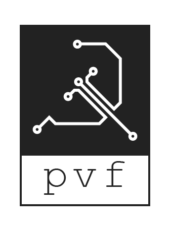
Another labeling option for the logo is to use it as a tile, with the label being just the acronym “PVF” being boxed in beneath the logo itself. This can be used for sidebars or when the logo is being used together with other logos. The proportions from the header version are changed slightly, with the font size being enlarged by a small amount to fill more space, this is also paired with a higher letter spacing to span more of the logo without raising the font size so much that it also creates a greater vertical weight.
Download tile: .ai, .jpg, .png, .svg.
Usage in Circles

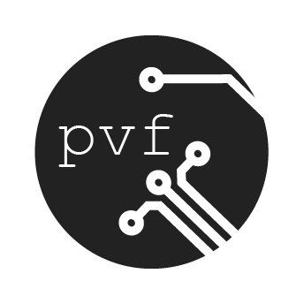
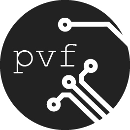
As many social media platform (including Discord and Twitter) use a circular format for their server or profile pictures, it is important to also consider how the design works when contained in a circle. The simplest way to do this is to place the logo in the circle and size it in such a way that it generally retains the padding and feel of the logo as it is in a square container. While this looks decent it may not look as good when shrunken down to the size that it would be on the aforementioned sites, mainly due once again to the usage of line art. That is not to say that it would not be recognizable or be on brand, but it would also not be as aesthetically pleasing as it could be.
Download circle: .ai, .jpg, .png, .svg; cropped: .jpg, .png, .svg.

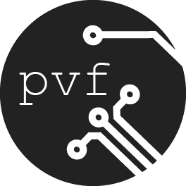
One solution to the scaling problem is to scale the logo outside of the scope of the circle, compromising the containment of the logo for a more clean look. This also allows for the placement of the initials “PVF” into the circle, which may to some extent make up for the fact that not the entire logo is contained within the circle itself when it comes to recognizability.
Download alternate circle: .ai, .jpg, .png, .svg; cropped: .jpg, .png, .svg.