Update March 23, 2020: Reformatted section titles.
Update September 18, 2023: Added style classes to paragraphs.
I. 序 論
こんばんは, it’s been a while since I’ve published anything on this website, but thru all the slow and sporadic progress on some upcoming work I’ve been nearly constantly looking ad a development build of it for some reason or another. This has caused me to make tweaks to various features on it over time, such as a recent switch to setting dark mode as the default. During this time I have also been putting some lackluster efforts into learning Japanese. I’ve been trying a variety of methods to learn and reinforce the language, from Duolingo to lessons on YouTube, but I had another idea that would help to garner more skill in using Japanese beyond simple grammar quizzes: writing.
This, of course, necessitates some more tweaks to the platform. I’ve previously added Japanese fonts for other posts, but if I’m doing entire posts in Japanese (or say posting translations of posts) I’d want there to also be some infrastructure to support multiple languages. Namely a) since I myself am unlikely to remember how to pronounce all the kanji used in something I write a week after I post it, there should be some furigana support and b) since the copy on the page will be in a given language the navigation and footer should also be in that language through the use of localization strings.
A quick aside before I really get into this: the dark mode on this site, in my experience anyway, suffers from a font rendering issue wherein the antialiasing algorithm creates too much brightness on adjacent pixels to the text creating a sort of boldening effect. There are supposedly solutions to this on OSX1, but no such luck on Windows.2 This issue is my main aesthetic aversion to my own dark mode, having only really switched it to the default because, as I noted on Twitter, I haven’t gotten around to implementing cookies to store the state3 and I needed the site to stay in dark mode at night to not disturb anyone in the same room as me.
II. 振 り 仮名
So the first question one must ask themselves when doing something is how do I
do that thing? Having first asked this of myself with regards to adding furigana
and finding no answer other than a half baked notion of complex CSS ::after
pseudoclasses, I decided to turn to the internet. Of course, the internet
doesn’t give answers to vaguely shouting “how do I make it so my website can
have furigana?” No, it answers clear, concise search queries. This is a silly
bit, point is I looked for, and found, a Ruby gem/Jekyll plugin that would add
furigana syntax on top of kramdown. This gem was “jekyll-furigana”. Two
problems immediately arose here: 1) this looked really complicated, what with
having to set flags on each post and using a filter on the content render, ugh;
and 2) this wasn’t on the GitHub pages plugin whitelist and thus could not
be added to my site.
God, so far this blog is nothing but dead ends, lmao.
So let’s take a step back, sure it would’ve been really convenient to have some nice convenient extension to Kramdown that did everything for me, but alas such a thing does not exist. Then we should start from scratch, obviously. What is furigana?
“Furigana is a Japanese reading aid, consisting of smaller kana or syllabic characters, printed next to a kanji (ideographic character) or other character to indicate its pronunciation. It is one type of ruby text.”4
Ignoring the totally irrelevant and meaningless first sentence, it’s ruby text.
But what is ruby text? Well ruby is what the fucking Brits called agate, the
traditional 5.5pt font size.5 Fine, I’ll stop joking around, ruby or rubi
(ルビ) is annotation text, usually about half the size of the main text. It’s a
more generic term than furigana (振り仮名) because it also exists in Chinese and
Korean.6 There is markup for this using the <ruby> element in HTML. It is,
however, a massive pain and really bulks up the text. Take, for instance, the
heading for this section:
<ruby><rb>振</rb><rt>ふ</rt>り<rt></rt><rb>仮名</rb><rt>がな</rt></ruby>
This is the most straightforward version of the markup7, where each base
character is denoted with a <rb> tag and it’s associated ruby text with a
<rt> tag. Do note that the “り” is accompanied by a blank <rt></rt> so as to
not have the final tag span the whole “り仮名” part. I don’t entirely understand
why that’s even a thing, much of the documentation I’ve seen refers to cases
like this and they honestly confuse me. Maybe I’m just too tired.8
お休みなさい. 😴💤9
~ S L E E P ~ B R E A K ~
おはよう!1011 Getting back into things here, an alternative form for the markup is what W3 calls “tabular.”7 This is preferable because the output is such that the string is searchable in an expected manner, a feature I hold in high regard here on The Web. However there’s a catch: it’s really only supported in Firefox. For instance, their example:
<ruby><rb>日</rb><rb>本</rb><rb>語</rb><rt>に</rt><rt>ほん</rt><rt>ご</rt></ruby>
on Chrome only places the first <rt> over the entire group of <rb> elements,
as per my testing.12 Now I should also note, since I’m getting into even more
options that don’t work, there is a fallback for ruby: <rp>, ruby
parentheses. These are hidden if the ruby markup actually works, otherwise they
show, easy:
<ruby><rb>水</rb><rp>(</rp><rt>みず</rt><rp>)</rp></ruby>
And now to delve immediately into a case where the fallback doesn’t even work,
complex ruby. The complex is distinguished from the simple, according to
W3 again, by the usage of <rbc> and <rtc> (the appended c to the
names means “container”… or “complex” if you want to be funny). This is
actually an XHTML/CSS3 specification and not an HTML5 one, so support is not
guaranteed,13 of course. Pessimism aside there are potentially workarounds so
we’ll get into that in a bit.
The basic notion here is that you use containers to contain sections and so a hierarchy is formed such that a container is associated with another container and the components within it with the components within the other. To steal an example from Wikipedia:
<ruby>
    <rbc><rb>振</rb><rb>り</rb><rb>仮</rb><rb>名</rb></rbc>
    <rtc><rt>ふ</rt><rt>り</rt><rt>が</rt><rt>な</rt></rtc>
</ruby>
Their example includes <rp> but again fallbacks do not work for complex ruby
so I don’t know what the fuck they thought they were doing.14 Anyway, this
doesn’t work at all, assuming our definition of work is only in regards to the
end output. If we add consideration for potential15 then it does something
at the very least: we’ve got markup that can be styled.
Ironically, this is preferable as far as implementation goes for the simple reason of regular ruby text has very little CSS that will actually apply. Take, for example, this lorem ipsum block with some Japanese tossed in:16
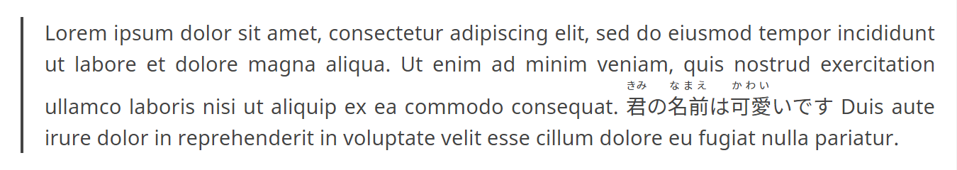
Notice how rather than displaying with the regular line-height property, extra
spacing is added in. This makes some sense as you would clearly need the space
in order to display the ruby text without overlap; however, there is little you
can do to manage this. Applying margin or line-height rules to any of the
components of the block doesn’t change the display, and changing the entire
text block’s line-height requires at least 2.3rem for there to be no visible
difference between the lines, which isn’t a style I particularly want to go for.
As a compromise, I could set a flag in the post metadata, something like
furigana: true, to apply such a style on a case by case basis, but I would
still prefer a solution with more consistency.
And then I found this stylesheet linked on Wikipedia: ruby.css (from
2007!). This does what should have been obvious: treat them like tables. Just
placing this right into this site would break all the regular inline ruby, so
we’re gonna need some tweaks. The issue is that it treats all <rb> and <rt>
elements as table cells, with the containers being table rows, which works for
complex ruby but not simple ruby. W3, again, provides a simpler stylesheet
which has the same problem:
ruby {display: inline-table;}
ruby * {
	display:       inline;
	line-height:   1.2;
	text-indent:   0;
	text-align:    center;
	white-space:   nowrap;
}
ruby > * {display: table-row-group;}
ruby > rt, ruby rtc {
	display:       table-header-group;
	font-size:     60%;
}
ruby rtc + rtc {display: table-footer-group;}
ruby rbc > *, ruby rtc > * {display: table-cell;}
ruby rtc > *[rbspan] {display: table-caption;}
ruby rp {display: none;}
I tested yet another stylesheet17 by Zoltan Hawryluk to the same effect.18 Seems then that I am at an impasse, the simplest solution, since these stylesheets work for what they intend to work for, is to just always use complex ruby. But that isn’t a solution, that’s bullshit, that’s fucking absurd.
But it’s all I’ve got.
It will have to do for now.
I can always come back.
I can always try again.
Fuck, I hate evenings. Let’s do it then. Going with the W3 stylesheet, decided
to just append it to my current sheet instead of adding another file and thus
more headers and such. This isn’t necessarily but worth noting, footnote
references will align with the top of the ruby text rather than ruby base using
this inline table method. The only other problems remain how it looks in a text
block, as well as rbspan implementation (for instance this example
provided by W3 does not work here).
Is this good enough? Is this fine? It looks better than when I started, it’s an improvement in that sense… but is it enough?
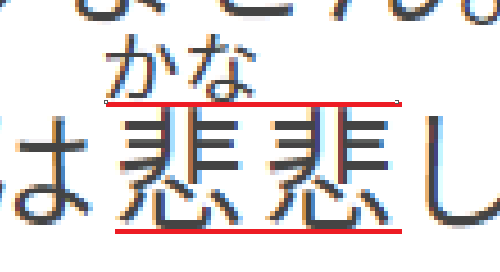
こんにちわ、元気?内はげんきではありません。内は寂しい。今日は漢字について話したいです。いいえ、あなたと話したいです。内は
しいです。 悲
Initial tests with the block above show there are issues with vertical alignment that need addressing, it’s aligning to the top of the text line, so the block extends below the baseline. This probably explains the footnote issue as well. Just telling it to align to the text baseline still seems off a bit. After finding literally no help anywhere from anyone I decided I’m just going to do some math. So as it stands the ruby text has a font size of $60%$ of the ruby base size, meaning the total height will be $160\%$ of the ruby base’s font size times the line height.19 Since the whole block seems to be aligned such that the ruby text’s baseline matches the baseline of the surrounding text, this means we just need to make the vertical alignment the percentage of the height of the ruby element that is taken up by the ruby base. Which of course means $100/160$ or $62.5\%$. Due to the way rendering works, there’s actually no visible difference within a few percentages of this value, if you raise it you can see the whole line start to move downward without the ruby block and if you lower it you can see the ruby block move downward.
Then on the line spacing issue, can just do a negative top margin with the
remaining percent: $100\%-62.5\%=37.5\%$ which would look something like
margin-top: -0.375rem;. This is all less than optimal, only currently tested
on my Chrome instance, only works assuming there’s only one layer of ruby on
top, and would all have to be recalculated if I want to change the font size…
but look at it!
Ok actually as it turns out all that math I excitedly did that worked? A
fluke! Well, not exactly, it’s close but maybe only by coincidence. I thought
that maybe if I increased the global line height to 1.6rem then our little
$60\%$ font size vertical-align: 59%. So I
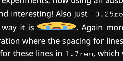
tried doing some more experiments, now using an absolute value. This time I got
it to align using 0.9rem.20 How specific and interesting! Also just
-0.25rem seems to work for the margin. I don’t know why any of this is the way
it is 😭. Again more experimentation, 1.8rem line height is the first single
decimal iteration where the spacing for lines containing ruby actually expands.
This implies the actual line height for these lines in 1.7rem, which would
make sense at some level, as per usual with CSS there seems to be some minor
spacing that isn’t directly stated in the styling.
Very cool stuff! Now let’s open it in another browser and judge the height of the bridge…21
Would you believe me if I told you I opened my local build in Edge and the only
problem was the ruby text was super fucking tiny? I don’t really get why, it
looks normal if I set it to 1em for some reason, all other text looks as
expected when I set font-size: 60%;. Hmm… at a loss on this one. I really am
this time. What the fuck. It’s just… so small… also just tried out Internet
Explorer: a) the toggle button for dark mode does not work and
b) wide emoji、fucking look at it:
It’s a really easy fix but it took me a while because it’s so fucking funny.
When I originally added styling for Twemoji on here I was being lazy as usual so
I just set height: 1rem; and assumed all browser would maintain the image
aspect ratio but evidently not, so I added width: 1rem;.
Having already spent more than a day on these updates, I’m just gonna pin the issue for now. Hell, I could even actually open an issue on the repository, now that’s a thought. I also haven’t tested any of this in Firefox, as I haven’t installed Firefox on this laptop.22 Also, like, if I thought trying to search for solutions to ruby text problems was hard, I don’t know how I intend to get though troubleshooting “edge font size issue”.
III. 地 域 化
I’m going to call ruby text support internationalization (i18n), as it is in a sense infrastructure that allows for the potential usage of international customs such as 振り仮名. Now, I will be hopefully tackling some localization (l10n), the modification of content to fit requirements of some other region than my own. I’m not part of some corporate pipeline so i18n and l10n are kind of blurred in my thoughts. For instance, what I’m going to be doing here will be in part creating a system for selecting content based on language, i18n, and also creating the content to be served per some given languages, l10n.
III-1. フォント (Fonts)
Before doing anything too fancy, I want to once again address something that’s been glaringly obvious to me while writing this all out: there is no monospace font defined in my stylesheet. This never really bothered me because my system settings were all standard U.S. settings and the monospace fonts were all smooth and paired decently with my body text fonts by default… but now my system is in Japanese and my monospace fonts are a bit more geared toward glyph complexity than smooth stylization. That’s fine for some instances but broadly speaking I would like some cross-platform standardization of my style.
Notably, while <code> blocks are mostly using system default at the moment,
the Prism highlighted blocks are not, this is of course due to the style:
code[class*="language-"],
pre[class*="language-"] {
  /* ... */
  font-family: Consolas, Monaco, 'Andale Mono', 'Ubuntu Mono', monospace;
  /* ... */
}
Just swell… if you’re fine with just grasping for whatever fonts the user already has, which is okay, I guess. That’s, what, four fallbacks? Just not my style, not right now anyway, I’m going full custom.24 This then means finding a monospace font to pair with current fonts.25
I would also possibly assert another criteria aside from “looks good.” See the reason why the current system font looks as it does is because it needs to be able to render kanji in the command prompt and things like that, so why not stick to the spirit of things and find a font that supports Japanese?
And so our typeface scouting journey begins… tomorrow… this might take a while and I should get some sleep. おやすみ❣
~ S L E E P ~ B R E A K ~
こんにちは,26 let’s find some fucking fonts. A decent candidate would be IBM’s Plex; aesthetically it’s alright, it has a decent roster of languages which will supposedly include Japanese in 2020 or 2021… so I’d be playing the long game on something I’m not totally in love with.27
Fun thing I noticed while searching: Google Fonts now has Noto Serif JP. I believe this is the same as Source Han Serif which I’ve been getting thru TypeKit for this site. Probably just going to keep that as it is.28
Continuing to search through i18n options, I stumbled on a patch for Blender that is meant to help display international glyphs in console… of course what use is a Blender path on a website? None, but it’s a lead. The notes mention a few fonts, such as DejaVu Mono and more importantly M+1M Regular. Now M+ is a massive font family, something like 40+ different variations in style and weight, plus a bunch of language support. Relevant to narrow this variety down is obviously that we want monospace, at least within the Latin characters. Of the 7 Latin fonts within M+, 3 of them are considered fixed-halfwidth, i.e. each Latin character will be half the width of a Japanese character. These three are M+ M Type-1, M+ M Type-2, and M+ MN Type-1; the “Type-*” refers to the main division of these fonts: -2 is a somewhat standard design, with all the curves and fancy stuff whereas -1 reduces much of this to straight lines whenever possible. Obviously we’re going to want Type-1 then, since we’re focused on simplicity for monospace. The question then becomes M or MN? What’s the difference here? Well to quote directly now:29
“M+ M emphasize the balance of natural letterform and high legibility. […] M+ MN Type-1 is aimed as a new distinctive design for a terminal font specialized to programming.”
So that’s what it says. But actually, looking at it, I don’t like its $ or its &. That all narrows it down to M+ M Type-1! 🥳🎉
Now to do some actual implementation.
The easy solution as usual would just be to use Google Fonts… but their early
access only has M+1p. Sad face. So look’s like I’ll be downloading the
files and doing some custom code. Installing web fonts is… simply put, a huge
pain in the ass. Generally you have an Embedded OpenType (.eot), Web Open Font
Format (.woff), and TrueType (.ttf) files all loaded in by the CSS, like:
@font-face {
    font-family: 'My Font';
    src: url('../fonts/my-font.eot');
    src: url('../fonts/my-font.eot?#iefix') format('embedded-opentype'),
    url('../fonts/my-font.woff') format('woff'),
    url('../fonts/my-font.ttf') format('truetype');
}
I’m sure, as implied by the #iefix bit, this is something to do with
cross-platform compatibility, but also it requires all three formats whereas the
download on the M+ site merely gives you the .ttf. Perhaps that’s where
the /webfonts directory comes in… though it seems to have less
coverage glyph-wise, it’s still probably my best bet. Of course they do provide
their own CSS to serve these from their own site, but that requires serving ALL
of the basic_latin/ folder and ALL of the general_j/ folder.
I just tried this on my local build, to see how everything looks, and I’m
noticing a slight issue with t and f where the horizontal stroke looks too
thick. This goes away when zooming in even one level, so it’s just a sizing
issue. Now, I’ve been struggling with the text size this whole time, see I was
never comfortable with anything larger than 11pt on here, as I felt that it was
too imposing on the screen; but with all this addition of ruby text and now this
issue, I’m now inclined to up it to 12pt.30 Also, I previously had no styling
to distinguish <code> from the rest of the text, as it was usually obvious due
to context or the font choice, but now with this font being fairly similar
(though with the fundamental difference of not being proportional) to the copy
style I should do something at the very least. This will of course mean a
simple background color, and a little bit of rounding to soften it.
code {
    background: #eee;
    border-radius: 0.2rem;
}
html.dark code {
    background: #222;
}
Back to the main topic, I downloaded the necessary fonts, added some
@font-face code to my stylesheet. I think we’re all good here now.31 Should
probably test how the widths look, so here:
<ruby>
    <rbc><rb>地</rb><rb>域</rb><rb>化</rb></rbc>
    <rtc><rt>ち</rt><rt>いき</rt><rt>か</rt></rtc>
</ruby>
Also went and cleaned up my TypeKit font selection, forgot for some reason that Noto Sans was on there (even though it’s already loaded with Google Fonts) and that I had Source Han Serif Regular which is actually never used since the serif style is only used for titles which are all bold.
III-2. テキスト (Text)
This part should be easy. Take any text strings in the template for the site and replace them with localization strings. Easy as 1, 2, 3…
Ok, so some of the template looks like this:32
You may share
{% unless page.license contains "ND" %}
    and/or modify
{% endunless %}
this work
{% if page.license == "ZERO" %} unconditionally*.
{% else %}
    so long as your usage meets the following conditions: proper
    credit must be given to the original author in a way that
    does not imply endorsement from the licensor,
    {% if page.license contains "NC" %}
        the work is not used for any commercial purposes,
    {% endif %}
    {% if page.license contains "ND" %}
        no modifications are done to the work,
    {% else %}
        there must be some indication if changes were made,
    {% endif %}
    {% if page.license contains "SA" %}
        any modified version of the work is distributed under
        the same license as the original,
    {% endif %}
    and a link to the license must be provided*.
{% endif %}
But really, that shouldn’t be too bad, it’s not like it’s heavily dependent on the grammar remaining constant cross-linguistically. How’s this: much of this is essentially shorthand, replacing specific parts of text under certain conditions rather than just rewriting the whole text. But also… I don’t really know how to write this in Japanese anyway so there’s that issue too. I mean, it’s just a rewritten version of the license descriptions, so there’s probably translations for most of it somewhere.
Well, anyway, let’s start with something simpler:
<div class="byline">
    {%if page.author%}
        By
        {%for author in page.author%}
            {%assign auth = site.data.people[author]%}
            {%if forloop.last == true and forloop.length > 1%}and{%endif%}
            {%if auth.url%}<a href="{{auth.url}}">{%endif%}
            {{auth.name}}
            {%if auth.url%}</a>{%endif%}
            {%unless forloop.length == 2 and forloop.index == 1%},{%endunless%}
        {%endfor%}
    {%endif%}
    {{page.date|date:'%B %d, %Y'}}
</div>
This sucks because there are no ternary operators. Ok, ok, let’s get it. First thought is to offload this all into a separate file. That way everything for localization can be handled in one place. Really wishing I could just do this all in JavaScript at this point… template strings 🤤.33 In theory this should end up looking like this:
<div class="byline">
    {{l10n.authors}} {{l10n.date}}
</div>
Flip a coin,34 decided on doing the date first. First we need to somehow
declare an array called l10n… how? So, you can’t initialize arrays, a
good start here. I fucking hate this language. I hate it so much. It makes me
angry ever time I try typing a fucking %, when I have to add separate escape
tags that are 9-12 characters long just to talk about it, when I try doing some
basic fucking thing like make my own object, or even my own array. Jesus fucking
christ I hate this. Anyway I guess they’re just gonna be l10n_authors and
l10n_date now.
General format here is just going to be a massive case structure. So here it is with the first example, date formatting:
{% case page.lang %}
{% when 'ja' %}
    {%- capture l10n_date -%}
        {{ page.date | date: '%Y年%m月%d日' }}
    {%- endcapture -%}
{% else %}
    {%- capture l10n_date -%}
        {{ page.date | date: '%B %d, %Y' }}
    {%- endcapture -%}
{% endcase %}
Also threw a little whitespace control in there, hopefully to reduce the complete illegibility of some of my template outputs, lol. Now it’s mostly just a matter of going through and systematically writing translations for every text string used in my theme.
Should note that capture is only used for these more templated variables, for
just regular text it’s a simple:
{%- assign l10n_tags = 'このポストのタグは' -%}
Also, since I’ll be adding a lang variable to the front matter, might as well
actually use it in the <html lang="*"> thing. This requires having a default
though, which of course will be en. Other than that, I suppose that’s it… I
just have to finish translating the footer which will take a while, but it’s not
like I’m going to blog about trying to understand the Japanese version of a
Creative Commons license page.
IV. クッキー (Cookies)
While I’m here,35 fuck it, going back on what I said: gonna just add some
cookies to this site. Currently dark mode is handled by a single class added to
the <html> called dark. A <script> is added to the page in
_includes/header.html which primarily added the isDarkMode boolean and
the toggleDarkMode function:
window.isDarkMode = true;
window.toggleDarkMode = function(){
    if(isDarkMode){
        isDarkMode = false;
        document.getElementsByTagName('html')[0].classList.remove('dark');
    } else {
        isDarkMode = true;
        document.getElementsByTagName('html')[0].classList.add('dark');
    }
}
A couple of things here: a) this assumes that the current classList on
<html> matched isDarkMode on page load, b) this code can be way shorter.
Check this out, we can toggle the boolean at the same time as checking it:
if(isDarkMode = !isDarkMode)
    document.getElementsByTagName('html')[0].classList.add('dark');
else
    document.getElementsByTagName('html')[0].classList.remove('dark');
Oh, here’s another trick, variable key selectors36:
document.getElementsByTagName('html')[0].classList[
    (isDarkMode = !isDarkMode) ? 'add' : 'remove'
]('dark');
There, that’s sufficiently golfed. I love it, it is my child, I will protect it,
do not fucking @ me. Now let’s make sure that we’re not just arbitrarily setting
isDarkMode without matching the actual classes by just checking the
classes.37
window.isDarkMode =
    document.getElementsByTagName('html')[0].classList.contains('dark');
Now we just add some cookie functionality! First off we’ll want to check if a
cookie already exists for this, and in order to do that we’re going to want some
string manipulation (because the cookie is a string). Fun! Fun! First let’s
create some object to store this all in, call it localCookies or something.
Then we will take the document.cookie string, split it by semicolons, and map
the resulting array to keys and values in localCookies:
window.localCookies = {};
document.cookie.split(';').map(
    x=>{
        let y = x.split('=');
        localCookies[y[0]]=y[1]
    }
);
Now we can just check this object for our specific key, say dark. If it does
not exist then we simply make it, set the value to whatever the current value of
isDarkMode is, and move on with our lives… well not quite. First of all, if
there are multiple cookies then the string will contain whitespace I forgot to
strip away, so uhh, lemme handle that real quick. Simple, really, just throw in
a trim() on y[0]. With that out of the way I present this brilliance:
if(localCookies.dark == null){
    document.cookie = `dark=${isDarkMode}; path=/;`;
    document.cookie = `expires=${new Date(+new Date()+32e9).toUTCString()};`;
    parseCookies();
}
else if(isDarkMode !== eval(localCookies.dark)) toggleDarkMode();
This also sets the path to / so that it applies to the whole site, as well
as setting the expiration of the cookie to slightly more than a year in the
future using a very exciting bit of shorthand. To explain it, first it gets
new Date which is then converted to an integer using a bit of a hack where you
just put + in front of it, then it adds 32e9 to that, which shifts it up the
approximate amount of time we want; this number is then used to create another
new Date for that specific time rather than the current time as is default;
finally this is converted to a UTC string and thrown into the template string.
Et voilà! Now we simply copy the document.cookie = 'dark=${isDarkMode};
path=/;';38 line into our toggleDarkMode function and we’re golden.
Footnotes
-
The solution is to set the CSS property
font-smoothingtoantialiasedas per this Stack Overflow answer. Though it would also seem that the OSX equivalent to this bug (see here) is far more extreme to begin with. Also, fun side note, apparently people would abuse this fix for stylization, see here. ↩︎ -
According to this answer this is because Windows uses ClearType. All I know is that, as per the MDN Web Docs, the CSS property simply has no implementation on Windows. ↩︎
-
Expanding on this: adding cookies to store variables that persist thru navigation of the browser using JavaScript is an extremely simple task. What is holding me up is that I’ve been trying to keep this site up to code as it were, and I’m using a misinterpretation of E.U. law to convince myself that I would have to create some sort of consent form to add a locally stored boolean even though the regulation is clearly intended only for cookies used to track users. ↩︎
-
Really just using Wikipedia articles to make tangential jokes because this is all boring even to me, lmao. Here’s the page for agate. ↩︎
-
Again mostly just reading Wikipedia here, but also check out this Q&A from W3 on the topic. ↩︎
-
This is the part where I start messing around with the formatting of this post instead of actually going to bed. Notable consequences include translating the entire title into 日本語39, remembering I added a subtitle feature and adding the English translation of the title, realizing I do not like the formatting of the subtitle feature and changing it from a
<h2>to a<h3>, and writing out this footnote.40 ↩︎ -
Last irrelevant and self referencing9 note before I go to sleep for real. Even I almost forgot that I added Twemoji to this site! I don’t think it’s so much feature creep as I constantly add improvements to the design and function of this site despite rarely adding content. For instance, due to there being old assignments from university on here, I also implemented MathJax:
\[\Psi(x,0)=Ae^{ik_0x}.\] -
I have three (3) keyboard languages installed: Japanese, English, and for some reason Korean. On attempting to type this, I switched from English to Korean, intending to subsequently switch to Japanese, but was stopped from doing so by Windows just bluescreening. 10/10, good fucking morning. ↩︎
-
For future reference, going to note the dates on these: 2019年12月9日. ↩︎
-
W3 actually provides a convenient test page for this example. ↩︎
-
It’s a bit difficult to garner the exact extent here without testing it all yourself. There is, in theory, a test page, but it appears to be broken.41 Searching for “ruby implementation” or “ruby support” doesn’t always provide useful results, even if you add “text” in there, since the Ruby language exists (lol this site is actually built on it, fml). A Chrome bug report for this has been open since 2009. Can I Use simply marks it as “Partial Support.” ↩︎
-
It’s possible, thought not absolutely certain, they simply expanded on the example included in the W3 page for ruby CSS styling. However, putting furigana on the word furigana isn’t exactly the most original sample text so who really knows. ↩︎
-
Here’s me acting all excited about how putting some fucking
<s and>s on a page lets you use stylesheets. ↩︎ -
This was originally actual text on the page but it’s bad form to just put code you don’t think is good in your markup just to show what it’s like. ↩︎
-
That link is to the stylesheet itself, which was accompanied by a full explanation of uses of ruby here, but didn’t go into any detail about the CSS itself. ↩︎
-
There was one interesting inclusion in this sheet that I haven’t seen in any of the other ones:42
rtc > rt[rbspan] {column-span: attr(rbspan);}Which seems to be an attempt at better implementation of
rbspanthan the other sheets which simply make any spanningrtact as a table caption. However, I couldn’t get this to work on account of my browser claiming thatcolumn-spanis not a valid attribute for this element. ↩︎ -
Actually this is sort of a mess because the line height shifts the baseline relative to the bottom of the element so it really isn’t an exact science. I’m just going to set it to
1because fuck dealing with any of that to be quite honest. ↩︎ -
Got the idea to use a constant value instead of a percentage since the percentage went down when the line height went up, implying there was some constant I was dividing down to anyway. ↩︎
-
…to jump off. ↩︎
-
I reset the OS on my laptop before moving to Los Angeles back in late October. Why? I dunno, seemed fitting. Also set my system language to Japanese as part of my attempt to reinforce the language but really it’s just made making shitposts in Photoshop a bit more challenging. ↩︎
-
The markup for this title is longer than my preferred line length (80). This is the problem I was talking about, and now my Markdown file is all fucked up. ↩︎
-
Of course I’m still going to have fallbacks, shush, I was being hyperbolic. ↩︎
-
The more I say “font” here, the more unsure I get about not using the term “typeface.” A font is just a specific implementation of a typeface, I think, like the former is code and the latter is design… probably. ↩︎
-
2019年12月10日, also notice how I’m saying こんにちは instead of おはよう. That’s right, I actually got some sleep. ↩︎
-
It would be convenient to have everything served through one simple system like Google Fonts. For instance, TypeKit uses JavaScript to load the fonts, this means no CJK support for noscript. But the reason it uses JS for CJK is so that it only loads the necessary amount of the font for that page. Truly a difficult decision here… could possibly attempt to do a backup. YES. A
<noscript>style include!?!? ↩︎ -
Since nearly all the styling on this site is in relative units, I don’t really need to adjust anything when I change the font size, yay! Of course it might be better to use the system font size so that people can adjust it in their browser settings for accessibility. At the moment I’m doing something like this:
html {font-size: 12pt;}
h1   {font-size: 2.5em;}
I.e. setting my own definition for
1em. ↩︎ -
I do think I should put up some licensing information somewhere when I do things like this, so probably going to make some sort of
/aboutto explain all the libraries and such that are used on this site. ↩︎ -
This is written in Liquid, I just straight up put template code into my post and assumed for god knows what reason that it would just display as regular code. To be honest I had no idea how to escape this, I tried backslashes before the tags, in the tags, after the tags, eventually just Googled it and someone said
literalwas the tag which is long and boring, luckily the real tag israw. 🥵💦 ↩︎ -
I’ve also been pretty salty about not being able to do mixins… though it seems that might be possible using
{% include mixin.html
    foo="bar" %}
. Just some food for thought. ↩︎ -
Literally decided I’d start with this two days ago, but y’know it sounds better to say it was random since I don’t have a real reason. ↩︎
-
“While” is carrying a lot of weight here, this part wasn’t written chronologically with the rest of the blog because it wouldn’t really make much sense, but I still wanted to document this and I just can’t focus on one thing at a time. ↩︎
-
Actually did a little oopsie woopsie when I first wrote this where I didn’t enclose
isDarkMode = !isDarkModein parentheses so it would be settingisDarkModeto the return value of the ternary operator. Ope! ↩︎ -
This is purely so I can change the default back to light mode just by removing the
class="dark"from the template, if I ever feel like doing that again. Also it just makes more sense to have this than not. ↩︎ -
The template string notation here is wrong, this is not entirely on purpose but I want to acknowledge it. The notation ironically conflicts with the code block notation in Markdown and I can’t get it to escape. ↩︎
-
The density of detail in kanji brings up some concerns about the formatting of footnotes on here. The font size here being intentionally small as they are notes and thus secondary to the main copy of the post, their style being mainly driven by an in-progress essay which contains several hundred of them and thus warrants this sort of compression. As of yet I am unsure of how to compromise on this. (Also, notice how this footnote is nested, but also referenced multiple times, the first reference being before the reference to the second reference and thus it appears in the list before its own reference). ↩︎
-
Did you know that you can nest footnotes in Kramdown? While I might be writing this sequentially after the footnote which references it, the parser will order the notes by their first reference in the text, and since the first reference to this note is within another footnote (at the end of the text) it will be last… assuming no other footnotes are nested after it. What does this have to do with anything? Nothing. It’s 午前二時39 and I am not sleeping apparently. ↩︎
-
Further searching actually found this results page, so I guess it’s not a total bust. ↩︎
-
Look, you can even have code blocks in footnotes! Can’t manage to set the language property for the syntax highlighter though. Normally this is done by putting the language name after the grave characters opening the block, but in this case I’m using tabbing to delineate the block. Another alternative workaround would potentially be to use Kramdown’s block attributes, like
{: .language-css}but that line would also be included within the block as displayed text. Another small issue with syntax is that subsequent text can’t be tabbed in as far, which sucks because I usually have the text for footnotes two tabs in so that they stay aligned after the declaration, but whatever. The only other workaround at that point is to write the entire markup for the block but I’m too lazy for that shit…Several-hours-later ウナ here! Turns out what needs to be done is to just not have the block code double tabbed. I don’t even really know how but it just popped into my mind when I saw some MathJax code and somehow it helped me fix 9 which is cool. Check it:
clamp=(val,min,max)=>{
    let j=(a,b,h)=>{
        if(a==b)return a;
        let c,d;
        [c,d]=[a,b].map((v)=>v>>31==-1);
        if(c!=d)return h?b:a;
        for(let i=30,e,f,g;i>=0;i--){
            if((e=a>>i&1)==(f=b>>i&1))
                continue;
            return e!=f&&e?h?a:b:h?b:a;
        }
    };
    return j(j(val,max,0),min,1);
}