- Preface
- I. How the fuck do you make a font?
- II. Just fucking get on with it.
- III. What the hell am I doing?
- IV. Kerning!?!? Kerniiiiing!!!
- V. Let’s just finish this!
Preface
Theoretically, I have a site specifically for programming blogs and documentation; issue with it is that it’s just thrown together out of necessity and hasn’t really seen any maintenance in years. So, I figure I should do some maintenance. I’ve been cleaning up a bunch of unused or otherwise unnecessary files and code, but along the way I realized that I really ought to reconsider the styling of it.
My gut reaction was try to be all technical and monospace, but honestly? That doesn’t work for me anymore, just doesn’t fit my personality. Now I’m working with just the broad concept of “可愛い🌸.” But how do I even implement that? I suppose starting with the font choice is a good way to go, as per the original monospace idea, so I scrolled through some available fonts on Google Fonts. Somehow, I did manage to get some inspiration there: handwriting fonts! But they’re all pretty mediocre; either too fancy to work as body text or too mundane to justify… so… make my own?
I. How the fuck do you make a font?
I’ve been reading some articles on this topic, and a lot of them seem to center the process of design rather than the technical details. Their depth of implementation is really just to direct you to some service… which is fine, more or less, but a lot of these services are pretty mediocre in terms of their range of features. Nonetheless, there’s definitely a point about the design process, let’s do that.
First, the scope of the font, what do I want it to cover? Well, if it’s handwriting, it’ll be my handwriting. This brings us to the obvious conclusion that it should just include all the things I can write… well, most of them. See, a while ago I posted a sample of my handwriting:
Here's a fun little sample of my handwriting. 🤤 pic.twitter.com/Lp1io115gM
— una, aspiring e-girl (@unaxiii) April 19, 2020
This covers Latin, Cyrillic, Greek, Kana, and a little bit of Hangul. We’ll cut out the Hangul because it’s incomplete and also I never write anything in Korean anyway. Greek is only really relevant to mathematics, which is leads me to a very annoying topic: $\LaTeX$.
See, even if I do manage to make a font, there’s an issue with using it for math rendering in that you can’t simply say “use this font file,” they’re all custom fonts from the developers of the library built in a specific way to work with the library. This is a technical hurdle that we can address later, will probably include an annoying amount of research and reverse engineering, but I’m going to try to push through it somehow anyway. Is going off on tangents bad? Who cares, I did find out that MathJax specifically at least has some tools for generating the data necessary to make a font work with it here. Still going to be fun to try to figure out how to get things like integrals and sigma notation to work out, not looking forward to it but definitely keeping it in mind.
Anyway, back to the basic designs, a big question here is should I include lowercase? I don’t normally write in lowercase unless it’s something like a note to my coworkers… but on web it definitely looks better to have mixed case than it does in a notebook. With that in mind, I think I’m going to go for mixed case. The whole bit about cap heights and descender lines is sort of irrelevant given that I am writing out the font by hand, lol, but also do need to make some sort of consideration for how it will be implemented in the end, I suppose.
That’s enough trying to be a designer for now, I think. So back to the technical1 details: should this be a raster font? I think in terms of usability raster fonts are sort of a bad idea, but in terms of actually making the thing it makes some sense. Well, it’s not as if I can’t vectorize my handwriting… it just seems weird to do so? A silly excuse, this should be vectors. So for now, I should just go ahead and try to write out every character I need… so I need a list for that. I’m going to compile such a list and come back to this after some sleep or some food, I think.
~ S L E E P ~ B R E A K ~
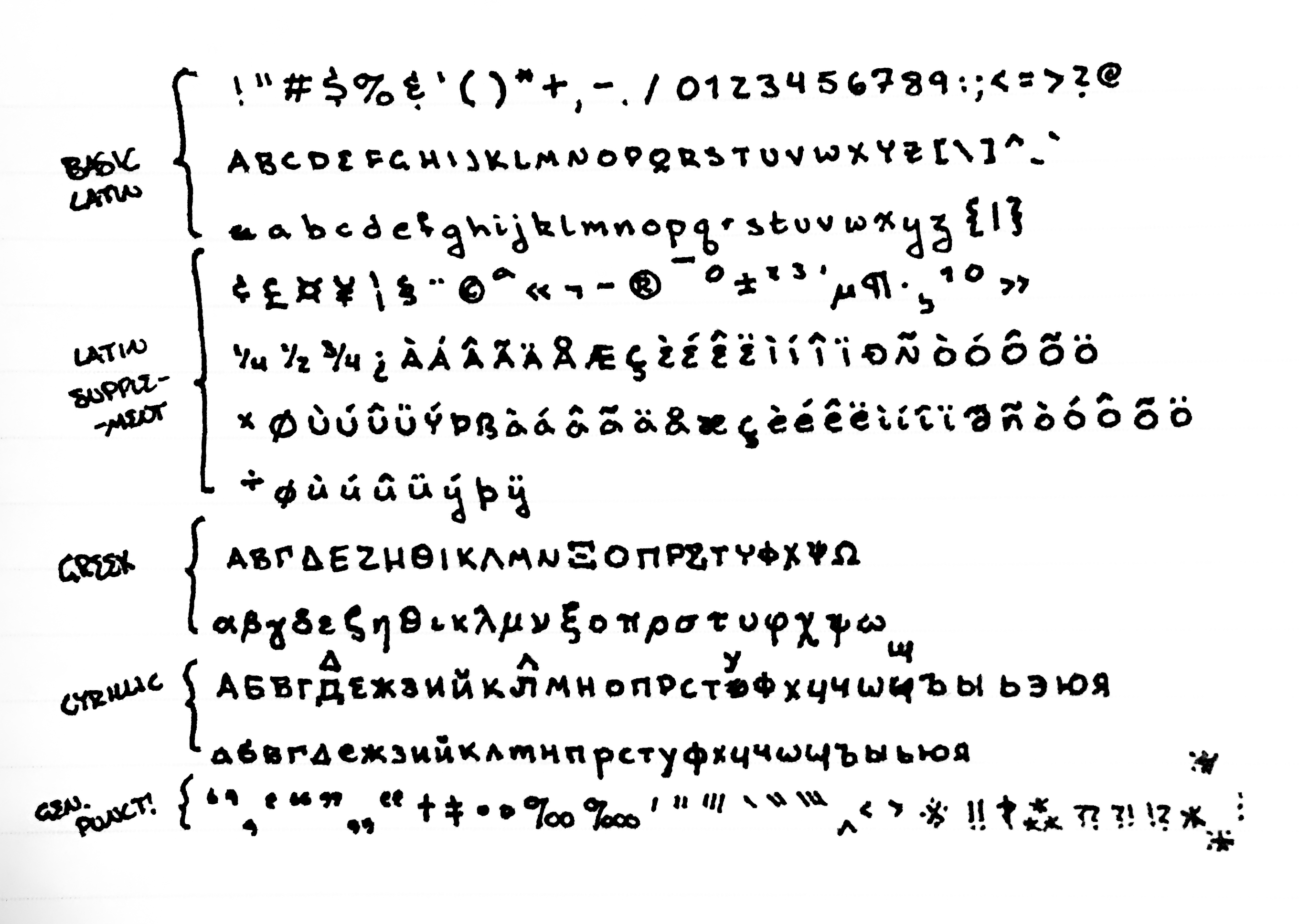
So, I got very distracted, read some manga, messed around with some grammar structuring, slept for a few hours, went to the store, really I forgot to actually do the thing I said I was going to do. Well, let’s focus and write out a list of Unicode blocks to cover here:
- Basic Latin
- Latin-1 Supplement
- Latin Extended-A
- Greek and Coptic
- Cyrillic
- General Punctuation
- Letterlike Symbols
- Number Forms
- Arrows
- Mathematical Operators
- Miscellaneous Technical
- Enclosed Alphanumerics
- Geometric Shapes
- Miscellaneous Symbols
- Hiragana
- Katakana
- Mathematical Alphanumeric Symbols?
I think that list should cover everything? It’s a lot. There’s more mathematical operator and symbol blocks… I’ll see if I need to deal with that later, I suppose. For now, I’ll just focus on the ones I know are necessary.
I’m just going to throw myself at this, really, write everything out on paper and scan it later. From there I might just deal with the whole vectorizing in Illustrator? Whatever tools seem to work the best, I guess.
You know what’s really boring? Writing hundreds of letters on a page from a list. It’s mind numbing, it sucks, I don’t have the patience for this. Should I just put on some anime while doing this? Should I be doing this some other way? Should I take shortcuts like using some prefab bits here and there? I’ve no idea, maybe I should start with just a sample set to get the workflow down… would really suck to put a ton of effort in only to decide to take a different approach to the problem.
II. Just fucking get on with it.
I’m hesitating.
I know that I’m hesitating. I just need to do this. I’ve figured out most of the workflow?
- Write out the glyphs.
- Scan the page.
- Trace glyphs in Illustrator.
- Save as SVGs.
- Import into FontForge.
This should work, I went with FontForge because it’s free. Apparently when the installer asks which language to use it’s just asking for the installer. The fucking thing installed in Japanese. Fine. This is fine. I don’t like learning new software like this, but fuck it at this point.
~ S L E E P ~ B R E A K ~
Here’s the thing, I have a scanner; well, access to a scanner. However, said scanner is down to flights of stairs and I’d have to carry my laptop down there and fiddle with the device settings and blah blah blah… So I just wrote out a few blocks and took a picture with my phone. This is professional grade. Industry standard. I’ve seen manga scans worse than this picture so I stand by my statement. Going to get the picture onto my laptop by using the USB cable for once, almost sent it to myself on Twitter, lmao.
Then, with a bit of adjustment in Photoshop (using Camera RAW Filter because fuck you), I have this!
So now I just drag this into Illustrator and run an image trace, obviously fiddle with the settings a bit, and at this point just have a bunch of vector objects… but, uh, what’s the x-height here? Clearly it’s my handwriting so the ascender line and cap-height are the same, but do I really draw my descenders so fucking long? Plus the quality of this is questionable at best, have to do a lot of adjustments. I hate making adjustments, lol. Should I really just draw them out with a tablet? Maybe, lol. Another idea: just use the scan as reference and trace it by hand using the pen tool… might be the best approach because then I can just adjust the stroke widths to account for scaling whereas with this current method I would have to either live with the strokes being inconsistent or deal with my natural size deviations. Really, that’s a stylistic choice and I’m not sure which direction to go with it…
Ok. After doing a whole bunch of other things (y’know spending some hours drawing and having to fix the internet connection here) I’ve decided to go with the pen tool route… which could take a few days, so I’m going to do it on and off.
~ S L E E P ~ B R E A K ~
Upon further consideration, maybe my ascender lines really are above my cap height. I don’t write in mixed case enough for this to really be something I noticed, I guess. There are other considerations that I really just sort of brushed aside here, like my handwriting is kind of contextual. My “I” looks different if it’s on its own than in a word, sometimes I write my periods as little circles, sometimes I cross my zeroes, I rarely dot my “i”s… could make adjustments for this sort of thing as I process the vectors, but still for now I’m just keeping on keeping on.
~ M O V I N G ~ T O ~ S E A T T L E ~
Bit of a pause in working on this on account of moving and such, hard to really find the time and motivation to sit here resizing vectors during that. On the topic of that resizing, as per some FontForge documentation regarding vector inputs the SVGs should be 1000 by 1000 pixels. Pairing this with the need to standardize the placing within the em square in relation to guidelines (baseline, x-height, cap height, ascender line, and descender line), I’ve started to process the traced vectors to such a format. Notably, the baseline is above the center as the descenders are pretty long, I’ve considered modifying this but have ultimately decided to stay true to form.
Some character have been modified more than others in terms of relative size, especially among #, %, &, and so on, since they were originally drawn significantly larger than regular text. My running principle with them is to treat them as modifications of alphanumerics as much as possible, namely “&” is drawn as a modified “E” and “$” as “S”.
III. What the hell am I doing?
I’ve been sitting there, just fucking taking these glyphs one-by-one and adjusting them to the guidelines. In that, trying to approximate the natural deviation of my handwriting, since almost none of these actually follow such a perfect alignment… but why? New strat: taking them in groups of four or five and adjusting them together. This way I can get the relative deviations without the group becoming too big to mess with.
Honestly, it would just look unnatural to force them onto the guidelines. At best, I could stretch some of them, like my “W” would be way too wide if I just scaled it to height, but I don’t want to do that so I’m keeping the fact that it doesn’t touch the baseline.
With that done, I just need to expand the paths, clean up overlaps and… uh… how the fuck do I get these into FontForge? It has instructions for HAND CODED SVGs and says there’s the possibility of using Illustrator! What the fuck! I’m looking up a solution, but every article is like “How To Design a Font,” like, bitch, I do not care. How do I get these files into the thing!?!?
Okay, not totally reading it right now but this article from School of Motion mentions this script for exporting.
The most useful glyphs to design (in this order) are:
& ? @ # $ % ! ( ) [ ] ; : ’ ’ ” ” , . - _ + =
(Note: You’ll need more if you want to make this emoji: ¯\_(ツ)_/¯ )2
This article just gets me, I think. I will be getting around to カタカナ eventually, tho… eventually. Still, not what I care about. Anyway, for this export script everything needs to be in layers… I originally did that, but with these alignments I did them as objects in a single layer… I’m a dipshit. So now I need to drag them all into their own layers. I named the layers by their Unicode names, which is cool, but scrolling like ninety layers down while dragging is a pin. Pro-tip: grab about half a screen height worth of objects and put them in the layer for the first one so the rest can just be directly dragged in to their appropriate layers. I’m genius now.
Well, with that done, I can just use the aforementioned script and get a nice folder of SVGs… I missed tilde, but whatever. Since I’m automating stuff now, which is nice, I think I’m going to go off script from the School of Motion tutorial at this point and make a namelist instead of importing the glyphs one at a time, lol.
Of course, I would like to not have to type out the namelist, but I can’t fucking think so here I am. Oof.
New issue! I don’t know how to use this program and my OS is set to Japanese so
the fucking thing automatically used Japanese localization! Found a thing
about this, which references a tutorial in French. Cool. Luckily
found another thing which just says to edit a .bat file… which I just
accidentally deleted! I’m a fool! Atom doesn’t have admin privileges to edit
it! Fuck! Ok, new plan, save it somewhere else and copy it in to overwrite the
original which should ask for admin approval which I will just push thru. Yay.
Now I can learn this thing~!!
Turns out the namelist doesn’t do shit. Unless I’m using it wrong… ugh. Not the worst, just manually imported each glyph. Whatever.
IV. Kerning!?!? Kerniiiiing!!!
Fuck my life, lmao.
So, like, basically, what I did first was quickly adjust the positioning so the glyphs weren’t super far apart, then I thought “hey, there should be some kerning here, how do I?” Turns out there’s a lot to that. See documentation thing.
What I’m going to do here is just manually kern every single pair. Why? Because this is handwriting, it’s not going to have consistent spacing, I’m just going to space it out how it would look if I actually wrote it.
Along the way I’ve been experiencing a number of technical difficulties, namely the crashes whenever I load too many kerning pairs, lol. That was probably a RAM issue or something since it did not persist after closing Illustrator. Tried following the tutorial more closely to try to avoid issues, but alas… somehow I made things crash again. Well, no bother, I will deal with this all at a later date.
~ S L E E P ~ B R E A K ~
FUCK. THAT. This is totally unscalable, I need to do this more smarter, as in actually do things by classes. Basically every single kern was a fairly large negative number (like -20 or -150!!!), so this is a bearing issue. I set all the bearings to 0 for now, going to go in an try to make them more reasonable… maybe like ??? 20??? 10.
This fucking thing keeps corrupting when I add classes to kern!!! Fuck!!! This sucks!!! Now I’m pushing every little update to the repo ;~;
V. Let’s just finish this!
I went thru and did all the kerning that came to mind, so I’m thinking I’m going to call this good for now with just Basic Latin. There’s still a fair bit more to do, but if I go thru it now then I’ll know what I’m doing when I start adding new characters.
First off, this was all thrown together in Illustrator so there’s a lot of Non Integral Points, i.e. control points that don’t have integer coordinates. This is supposedly not a huge deal but it can cause problems on some platforms so I’m just spamming “fix” while it lists all the points. I can probably avoid this in the future by fiddling with the SVG export settings, so I’ll keep that in mind! Actually, should probably just write out a precise guide on what I’ve been doing here that’s a bit less whiny, lol.
There’s a whole bunch of tests and I’m not sure how relevant they all are, much of them are to do with rendering style, i.e. a perfectly vertical line renders better than a nearly vertical one or points near the x-height should be at the x-height for consistency. Stylistically, following every such guide would kind of ruin this, so I’m ignoring most of them.
Running the full font validation to only see significant issues then, and splines with extrema beyond their endpoint seems to be the theme here! Should look into how to fix this ahead of time but again spamming fix, and of course this means new points that aren’t integers!! Why god?!?!?
Self intersecting points are pissing me off. There’s definitely something about
it being easier to just do this at the SVG stage, since you can just read thru
the code and find any such things… as far as I know what makes a spline self
intersecting is that it begins and ends at the same point? This should be easy
to find in code, not so much in graphical editors. I’m assuming this problem
originates with the moving points to integers, so tiny little splines would be
reduce to two overlapping points, which again can be avoided early on. To fix
this, I’m going to actually go into the .sfd file and manually remove the
points, most of them don’t appear to actually be control points, just l 2
whatever the hell that means. Ok, I lied, that was only in }. Angery.
Ignoring the validation checks for now (lol). Just testing exports.
Initially, no kerning on Windows. None. Not even in Adobe products. So now I’m
messing with adding OpenType options and Windows-style kern to the export
settings. Using .ttf for now. The font preview in Windows is showing it all
good now, so I just need to export it as the other filetypes and I can start
messing with it in web design.
While reading up on trying to get a .eot file, I did find out you can round
all points to integers using the “Element” menu. Very cool. In any case, I’m
using Fontie to handle the conversions and such for now.
Oh, and since I haven’t added quotes or anything yet, I have to turn off pretty quotes in Kramdown for the site I’m testing this on! Cool!
New issue: heights. I don’t know what I’m doing!!! I’m trying to adjust the ascender and descender and none of this is working??? I know my descenders are pretty long, but I can’t seem to get the baseline in the right spot :/ Ok, so I’ll just adjust it all to be 500 and 500 then transform everything to match the baseline, that seems to work just fine, yay me.
Anyway, the rest is just fiddling with the stylesheets, nothing to do with the font. So, that’s all! Good enough! I’m “done.”