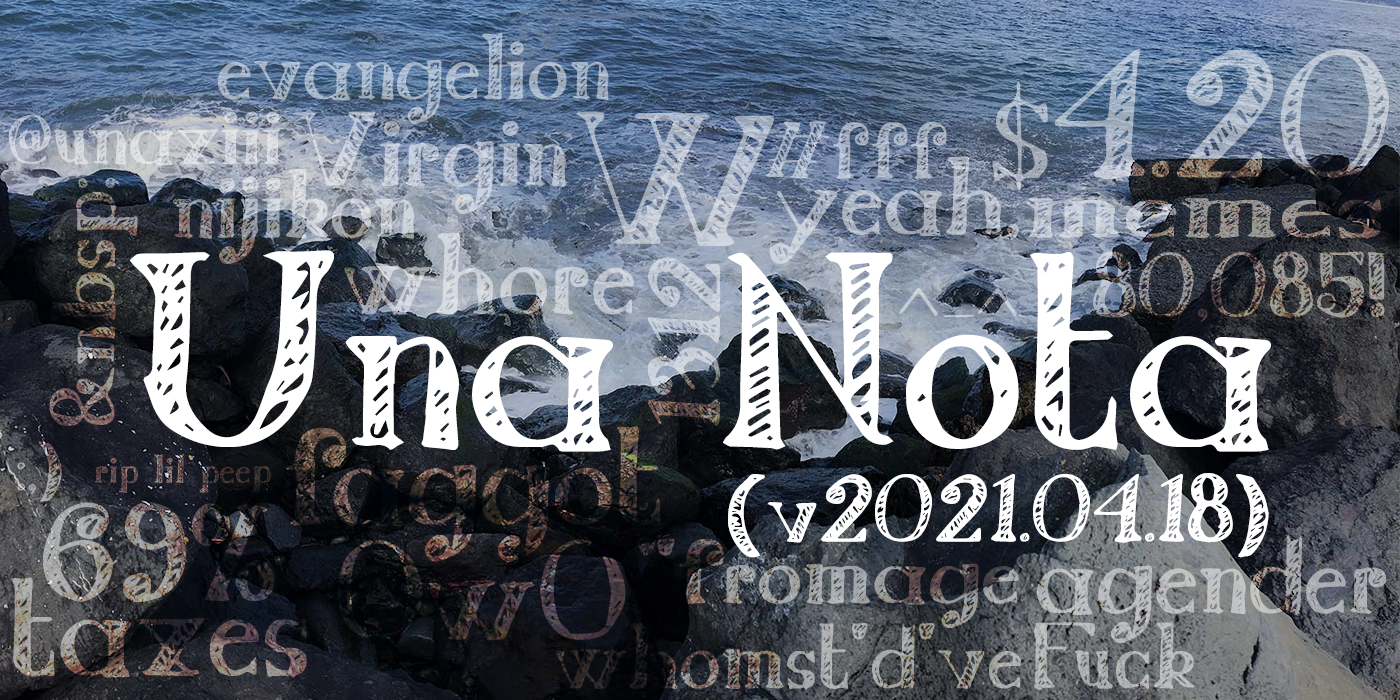
Preface
I made this font while sad about not getting tacos, and so it’s called “No Tacos :(“ or just “Nota” for short. The approach here is to simply not put in too much effort, because, to be honest, I’m just really not feeling it today. On the other hand, I did need a title font to match with my previous font, Una Script. So, what’s going to happen here is a very low effort, high contrast, serif font.
Actually, low effort is kind of the name of the game as far as the Una fonts go. Una Script was intended to be cutesy, but that was really just a convenient result of the fact that people generally consider my handwriting to be so already. Here I will be aiming for something along the lines of trying to write a fancy title in your notes at school (I have done this before, I don’t know about anyone else). This effectively means a lot of straight lines done with a straight edge, but without a constant angle or any sort of template; all of the curves and even some of the lines will simply be done via eyeballing.
Rather than simply calling this font “Nota,” it will be called “Una Nota,” to avoid confusion with existing fonts and to denote its inclusion in the Una font family.
I. Design
The initial design was done in my notebook1 with some quick pencil2 sketches and then outlining and filling done in pen.3 Each glyph was drawn as nearly two lines tall, the riser line being drawn in with a straight edge without any measurement. Because the line guideline between the two lines in which the glyph was drawn was already present, it was used as the x-height; and given that the ascender line was drawn below the existing guideline on top of the line, the x-height here can be considered rather high. Regardless, this was approached as a Didone font, but no references were used.
Onto the more elemental details. Serifs were inconsistently added, mostly hairline serifs with some attempt to make a few appear like transitional or wedge serifs.4 Similarly, terminals were added wherever sort of felt right at the time. Positioning of tittles was given no thought. The stems are incredibly inconsistent as nothing was used to measure them, same for the angles of the arms. All the apexes are flat, whatever. Apertures were guessed, i.e. eyeballed, and counters were drawn in with (what I would like to consider) a delicate touch and prayer to the typographical gods for however little favor they have left for me.
For stylistic consistency, all filled sections were done with sloppy hatching, though a few show a bit more effort than others. The resulting designs can be seen here:
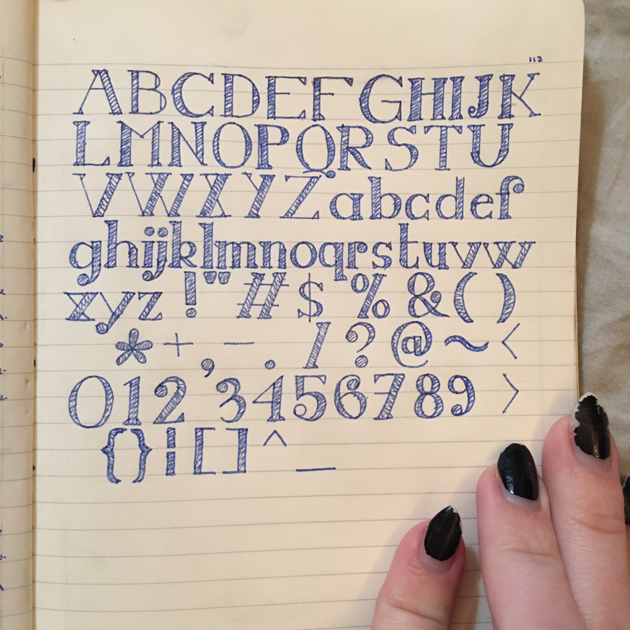
With this image in mind, let’s discuss some specific glyphs. We’ll just go through some notable ones in the order they appear here, which is (hilariously) not the proper order for an ASCII table or the appropriate Unicode table.
- “F” reaches over way too far, lmao.
- “G” has a terrible beard, designed like a serif by someone who forgot what a serif looks like.
- “P” has a stem that was completely off vertical and later attempts to correct it did not help.
- “Q” is supposed to have a tail… I suppose that counts.
- “R” is a failure. Massive fuck up. I’m not going to fix it.
- “W” is probably my favorite in this whole set, it is my child and I will defend it.
- “d” has an incomplete stem.
- “f” looks more like a long s (ſ) because I drew the terminal without
thinking about the spacing necessary for the crossbar. - “g” is single-story and this is a stylistic choice not simply due to my ineptitude and laziness.
- “j“‘s descender goes too far left but “yolo.”
- “u” and “x” are simply the results of terrible planning, or lack thereof.
- “y” is absolutely horrendous, it sucks, I hate it, kill me.
- “3” was a mistake. I don’t know what happened there, I guess I tried to go for, like, and oldstyle “3” but as a lining digit and…?
That’s enough self-deprecation, though. Overall, I think the style works as intended. In the words of my girlfriend, the emotion conveyed here is like “I’m going to punch a hole in my wall while listening to Green Day because my mom won’t take me to Taco Bell.”
II. Vectorization
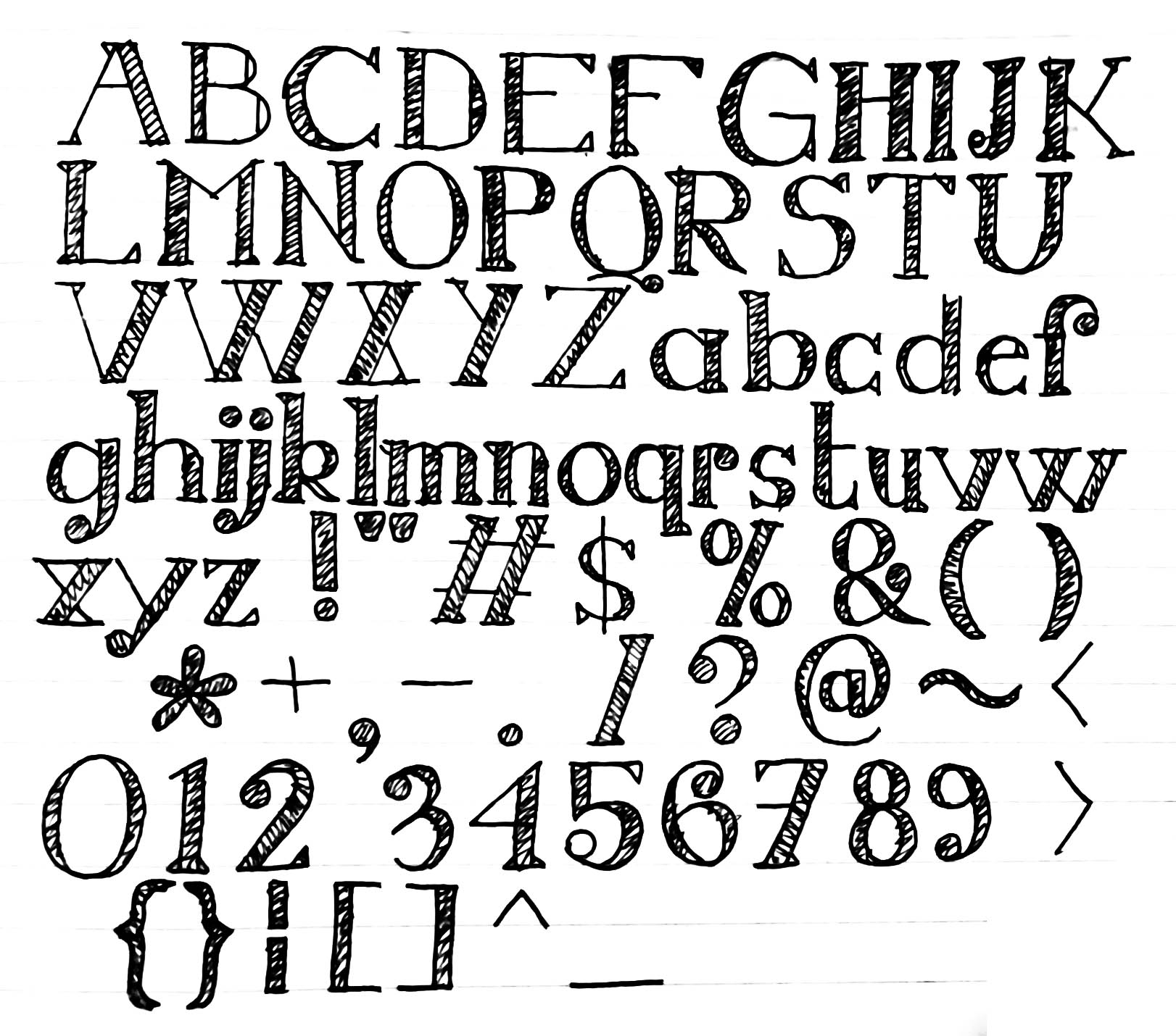
Making usable vectors from a thrown together sketch in a notebook is a process that one could potentially take very seriously. As with Una Script, I will not be doing that. Not only did I once again not bother to scan the paper despite access to the proper equipment, I didn’t even trace the vectors by hand this time. Before any of that, I had to take the picture (from the previous section) and get it into a bit more of a readable format, specifically getting it as high contrast as possible. Here I used Photoshop, first applying some cropping and then attempting to use the perspective crop feature to get it more flat since the page was pretty warped and also just general distortion from taking a picture. Then it was on to the Camera Raw filter, because I like having everything in one place. Typical adjustments to exposure, contrast, tweaking highlights and shadows, and some attempts at trying to use the dehaze filters and such to get a clearer image. This resulted in the following image:
At that point I could then drag it into Illustrator and apply a trace. This is, of course, a decently complicated procedure as there are many adjustments to make and each requires a complete reload of the filter that takes forever because my laptop is dying (please send me money so I can buy a new laptop). Finally each glyph was resized in a new document with guidelines for the em- square: ascender/cap, baseline, and descender, all based on the “P” and “g” glyphs. Some glyphs, such as “:” and “=,” were built using copies of glyphs that were similar to their parts, because I did not draw those in the draft.
This time around, I ensured each glyph was in its own layer, and each layer was named after the appropriate Unicode character in camel case. With that all done from the start, as well as the fact that everything was already traced as filled objects, exporting was a simple matter of running the layer export script.
III. Building
And here we are, finally building the font as a font. I didn’t put much effort into this, simply imported all the glyphs, ran some automated fixes (rounding control points to integer, adding extrema, fixing direction, &c.), and ignored a bunch of other errors. Hinting was all automated. Also didn’t bother adjusting the ascender and descender heights in the font info. The most effort that was put into any of this was the kerning (because of course it was), specifically with “F” and “f.” The “j” glyph was a low effort negative spacing on the left so I didn’t have to put in all the effort to make a whole bunch of custom classing just for one single glyph.
And that’s it. This font sucks and I love it. Check out the repository and download it if you want to: https://github.com/una-ada/una-nota