These past few years, I’ve been doing some world-building for a number of novels I wish to write. As these stories ought to exist in the same world but during different eras, I need the setting to be fairly robust. Not wanting to feed my tendency to get bogged down with details, I decided to primarily lean on existing geography and language to provide the foundation for everything else. Of course, it is preferable in fiction to provide some semblance of our shared reality as a foothold for the reader’s understanding, but it is also rather boring at times from a development perspective.
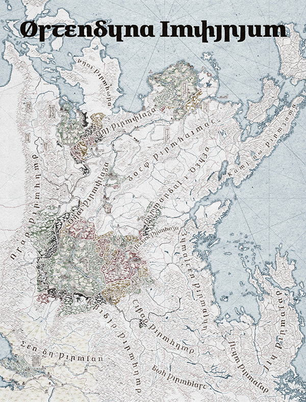 Figure 1. Map of Wydheth, animation showing progress throughout 2025.
Today’s focus is, of course, on language, so I’ll skip any ramblings I might have outside of that as much as possible, but check out Fig. 1 for how the map’s been going at least. For my own convenience, the Østendūn Imperium in which my plots are set is linguistically Germanic. Throughout its many territories, the languages spoken range from Gutnish to Scots, Elfdalian to Bavarian, all unified under a single Imperium with a single script. That script, following the conventions I believe to exist in many Narōkei fantasy works, is essentially Latin with some light cryptographic stylization:
Ɑɑ Бb Bβỽ Ᵹᵹ Ꝺδꝺ Eε Ƿƿ Ꝣꝣ Hh Þþ Ȝȝ Iı Jȷ Ոη Kκ Ll Mm Nn Ξξ Oo Ȣȣ Փփ Ꞃꞃρ Ꞅꞅ Ʃſʃ Ꞇꞇ Ccς Ʒʒ Vu Yɥ Ꝼꝼ Øω Ꝿջ
I’ve been keeping a document, the Cyclopædia, of my work on this world, and since it’s focused on Østendūna, everything includes transliterations into this script. However, there must be other scripts for it to be a more complete world, so I’m mostly just repurposing existing scripts to various languages; e.g. Akkadian written in Oesol (Deconstructed Hangul), Japanese (replacing all kanji with their kun’yomi) in Kannada, and Hungarian in Thaana.
This came to a head when I decided to work on a language for magic. See, south of Østendūna is Lilhia, a desert region which speaks Tangut (following my previous idea for a Latin-like script, I went with the obvious choice for a Chinese-like script here). Inspired in some part by Zoroastrianism’s Avestan, I wanted a distinct liturgical language for the region which, inspired by the form of Akkadian incantations, would also be used to construct prayers that serve as spells which borrow power from my world’s Wyrms, i.e. gods. For the writing system, I went with another script similar to Chinese: Nüshu. The vocabulary was then chosen, for my own accessibility, to be Toki Pona, which clashes quite a bit phonemically with the Xiangnan Tuhua dialect for which Nüshu was designed. This resulted in the making of a great many spreadsheets, as, at this point, writing things out in Scrivener was no longer feasible due to the size of the tables. After all, I had opted to simply match the pona with hanzi of similar meaning, which were then matched to the Nüshu meant to transliterate them, resulting in a significant number of homophones distinguished at most by slight tonal differences that are beyond the ability of my Anglophonic mouth. For exampled, seme > 何 (hé) > 𛇮 (fu42) and ona > 夫 (fú) > 𛆔 (fu44). Remapping the resulting Nüshu onto an entirely new phonology (e.g. ha and fu respectively for the previous examples) resulted in yet another spreadsheet, and at that point I was all in on just making spreadsheets for all my linguistic endeavors.
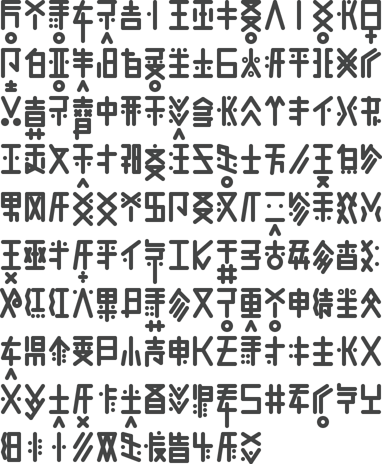
 Figure 2. Liturgical Lilhian glyphs.
As an aside, Nüshu’s form is influenced by usage in embroidery, which is rather unique among writing systems, more often you find influence from carving in stone, leaves, clay, etc. This is rather unsuitable for my uses, however, so I’ve forcibly skewed the forms back into a rectangular style to evoke more an image of futhark or the like (see Fig. 2).
Now, obviously, given all this remapping, mixing, and matching I’ve been doing with scripts, I decided to make such endeavors easier should I desire to do so again in the future. This resulted in the very normal pastime of sorting every Unicode encoded glyph from an alphabet, abugida, and abjad I could find into a spreadsheet sorted by phoneme which I’ve thus dubbed “comparative orthography.”
Data entry is mind-numbing work in general, but obsessing over something inevitably teaches you something, right? At the very least, this kicked the slumbering cat in my brain that thinks that I should just make my own things sometimes. Atop that, there was a discussion with my friend Mea regarding that aformentioned magic language, Liturgical Lilhian as I call it. She had mentioned all sorts of cool visuals one associates with magic runes and scripts, floating letters when spoken aloud and such, but despite that being an excellent option for aesthetics, it doesn’t work with the world-building. Liturgical Lilhian is meant to be just one of many languages used for borrowing power from Wyrms, a fairly obscure one used only by the most dedicated of nerds who value efficiency and obscurity to such an extent they’d likely want to avoid visual flare (think Rust but for magic). The conclusion here is that I should just make a language with more flare! As a change of pace, I decided I would actually put in the work for a conlang here, which is something of a small undertaking.
I. Phonology
So, new language, I have to decide on phonology, morphology, grammar, and orthography. As for morphology and grammar, let’s just copy Hungarian! Well, I’m torn between Uralic and Semitic for morphology, and for grammar I definitely want six grammatical genders to match the six elements of magic in this world: aether, air, earth, fire, metal/stone, and water. That’s all a problem for later, however, the most important decision is obviously the phonology. How about Hmong with a bit of Mandarin? That might seem a bit crazy as an English speaker, but I can always pare it down later if need be. I mean, I’m from the Midwest, certainly I’ve picked up the ability to at least pronounce Hmong phonemes via osmosis at some point, right? So, for consonants, I get this chart:
| Labial | Dental | Alveolar | Retroflex | Palatal | Velar | Glottal | |
|---|---|---|---|---|---|---|---|
| Nasal | m̥ • m | n̥ • n | ŋ | ||||
| Plosive | p • b | t • d | c~ʨ • ɟ~ʥ | k • g | |||
| pʰ • ᵐb | tʰ • ⁿd | cʰ~ʨʰ • ᶮɟ~ᶮʥ | kʰ • ᵑɡ | ||||
| Affricate | ʦ • ʣ | ꭧ • ꭦ | |||||
| ʦʰ • ⁿʣ | ꭧʰ • ᶯꭦ | ||||||
| Fricative | f • v | θ • ð | s • z | ʂ • ʐ | ɕ • ʑ | x • ɣ | h |
| Approx | l̥ • l | j | |||||
| Trill | r |
Table 1. Consonant inventory.
That’s certainly a lot of IPA symbols that the average reader wouldn’t recognize; not to worry, though, you can simply ask Wikipedia about them! I’ll get around to doing vowels later, for now we’re moving on with orthography.
II. Orthography
My idea for how to approach the orthography was, because I’m like this, rather Chinese. Well, it’s fairly international, actually. First, draw something pictographic, à la hieroglyphs or Shang bronzeware inscriptions. In my case, I decided the characters would be onomatopoeic in nature, thus the pictographs would represent the source of the sound, e.g. a cat for /m/, snake for /s/, or bee for /z/. The key is balancing the right level of detail; I was really inspired by the inscription which developed into 龍 (lóng) as I drew these (I mean, look at that little hat).
Next is the process of turning pictographs into graphemes. You can compare this to the development of Egyptian untiliteral signs into Proto-Sinaitic then Phoenician, or bronze insciptions into oracle bone script then seal script. It’s basically abstraction, trying to draw the same thing but in fewer strokes and less time (see Fig. 3). This is also where medium starts to really affect the script, my medium of choice here being the whiteboard my wife gifted me for Christmas last year. Regardless of this questionably ahistorical choice, I trudged onward until I had covered my entire consonant inventory.1
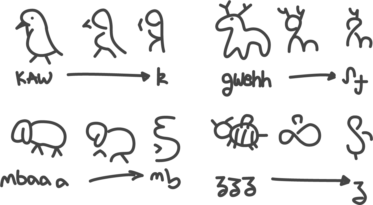

Figure 3. Examples of my approach to glyph design.
As evidenced by Fig. 3, the graphemes I’ve created are rather… loopy. My wife provided feedback throughout this process, and that loopiness was one aspect she brought up as a potential issue for realism (I know for a fact that she only learned of Glagolitic recently). In the moment, it felt right to draw the characters like this, in part because of the medium I was drawing upon. I did try other methods of abstraction, such as a more Chinese approach of top-down strokes, crosses, and boxes which I simply didn’t vibe with at the time. Of course, I can and will justify anything that I like in the world-building, so that’s what I’ve done here. See, this is a script for magic, not just any old writing system. Would it be carved into stone like Phoenician? No! It would be drawn onto skin with blood, onto stone with chalk, or into the air with pure energy. Therefore! The loopiness is acceptable… nay, preferable! Yes, preferable. Moving on.
III. Miniscule
Should this script be bicameral? It is my opinion that miniscule scripts are a wholly European idiosyncracy, and thus not the best to mirror in constructed languages. Regardless, aesthetics trump realism, so the question is instead whether it would improve anything. My wife’s advice was to do what looked most natural, starting by writing out samples with the current inventory. I, of course, already know how to develop a realistic miniscule and thus immediately set to comparing the two.
So, how does one create a miniscule? Let’s ignore some of the boring examples such as Deseret, where miniscule only exists to mirror the form of Latin typography and thus is a mere downscaling of the majuscule. Miniscule in Latin derives from Carolingian miniscule, which in turn came from uncial (possibly itself derived from Roman cursive). Greek miniscule as well derives from uncial via cursive; the clearest example of this is Ξ > ξ. What we can learn from this is that a miniscule is best created from a righting of cursive script; first, write the original script in as few strokes as is reasonable, then normalize the results to match up to the form of the majuscule. Figure 4 shows the first step of this process, though with clear intentionality for the later step.
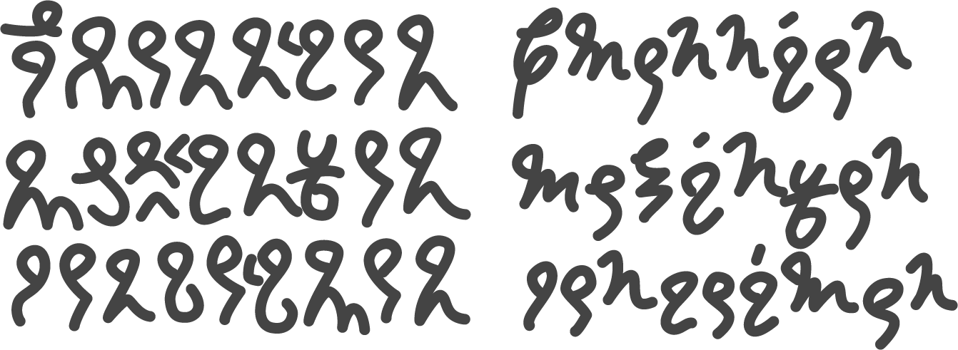

Figure 4. Comparison between the original script and a cursive form.
This miniscule was said to feel more realistic than the majuscule, though I would argue that it simply appears more akin to Latin. If anything, I’d say we moved from BCE to CE with this, but that’s entirely based on my handwriting. What’s needed is more clear reference forms, and for that we move on to digitization.
IV. Digitization
When it comes to digitization, I could simply do as I did with Una Script and merely vectorize my own handwriting; however, this wouldn’t provide a reference form as desired. Instead, I ought to design a font that looks deliberate, fitting in with existing fonts but for another language.
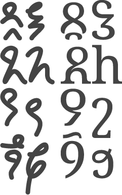
 Figure 5. Comparison between the original graphemes and the serif-font glyphs.
Since I use Google’s Noto fonts for copy these days, I figured I’d design this new font to match. This lead to the subsequent decision of whether to base it on Noto Sans or Noto Serif. I do tend to prefer serif (or modulated) fonts, so this was an easy choice for me. I’m pretty sure the OFL allows for mushing the pieces of a font together to make a new one, as long as I credit the original. Given that I haven’t exactly published any of the font itself yet, consider this your advance credit.
The design of the glyphs could definitely be seen as another layer of abstraction, as I aimed to recreate the general strokes with existing elements of Noto Serif. An unbelievable amount were some sort of ‘8’ and ‘n’ chimera, but many needed elements not found in Latin. For those cases, Noto Serif Armenian (e.g. ՈՑշջ)2 and Noto Serif Georgian (e.g. ᲒᲨჩⴌᲴᲰთჳⴗⴘⴤ) were used instead.
In some cases, I basically outright copied a glyph, which runs into another thing my wife mentioned before: if people think they know how to read it they’ll read it wrong. There’s not much I can really do about that at this point! The /g/ looks like a ‘p,’ the /s/ looks like an ‘h.’ Some letters are copies of Armenian or Georgian letters, so I doubt the average English speaker will be too confident on an incorrect reading, but I’m just going to have to not care about that. I would love for the whole thing to look completely alien, but that isn’t possible when I’m putting together pieces of existing scripts.
You might notice that this process has killed a bit of the flare in the miniscule/cursive script. While completely intentional for the sake of consistent appearance among other scripts, it is a bit of a shame. As a compromise, I could make italic (oblique) glyphs that follow the cursive more closely, cf. Cyrillic. I could make use of the curl on ‘ƪ’ to recreate some of the flourish on ascenders. Regardless, this is an issue for the future.
Then comes the question: as a font, where should I encode the characters?
Obviously, this is going in the Unicode
Private Use Areas (PUA),3
but where? I generally want to avoid overlapping with something like the
Medieval Unicode Font Initiative (MUFI) and
definitely want to avoid something I would actually use, like
Oesol. Thus, after
much contemplation, I decided on going for U+F700-F7FF as it has minimal
impact on MUFI.
Having the general block is good, but I also need to decide the exact ordering of the glyphs. This usually follows alphabetical order, but I haven’t decided such a thing yet! My Illustrator artboards are organized to match their locations on the IPA chart. The exported files are sorted alphabetically by artboard name, but they’re named things like “capital dz retroflex prenasal.” I could sit here for days trying to decipher how Phoenician ended up in that order and how to recreate the process myself, but I’ll just stick to my classic approach: sorted by Greek. It would probably make more sense to sort it like Pahawh Hmong since the phonemes would line up better, or even Bopomofo (though their orders are, of course, fairly comparable), but I didn’t think of that!
This also requires me to actually figure out the vowels, which I was not prepared for at all. I was just going to lean on Hungarian here: /i, iː, y, yː, u, uː, ɛ, eː, ø, øː, o, oː, ɒ, aː/, but got all indecisive and wanted to mix in my favorite strut vowel /ʌ/ and also /ɪ/. Then when I wrote them all out with those, I didn’t pay attention to the contrasting long and short vowels, so there’s also things like /e/ and /ɪː/. Plus, I decided to give four rows, or 64 encoding slots, to both majuscule and miniscule, but miscounted the number of consonants and had to drop /ø, øː/ from the end. The result is a mess, but they can always be swapped around if need be, like removing /ɛː/ and putting /eː/ in its place. At least a decent number of slots are assigned to the yet-to-be-designed vowels, so I’m sure it will work out. With that, the tentative assignment chart looks like this:
| 0 | 1 | 2 | 3 | 4 | 5 | 6 | 7 | 8 | 9 | a | b | c | d | e | f | |
|---|---|---|---|---|---|---|---|---|---|---|---|---|---|---|---|---|
| U+f70x | a | aː | ʌ | ʌː | b | ⁿb | v | g | ⁿg | ɣ | d | ⁿd | dz | ⁿdz | dʐ | ⁿdʐ |
| U+f71x | ɟ~ʥ | ⁿɟ~ʥ | ɛ | ɛː | z | ʐ | ʑ | e | eː | θ | ð | j | i | iː | ɪ | ɪː |
| U+f72x | k | l | l̥ | m | m̥ | n | n̥ | ŋ | o | oː | p | r | s | ʂ | ɕ | t |
| U+f73x | tʰ | ts | tsʰ | tʂʰ | tʂʰ | c~ʨ | c~ʨʰ | u | uː | y | yː | pʰ | f | kʰ | x | h |
Table 2. Unicode assignments based on phoneme.
This table repeats on rows U+F74x-F77x for the miniscule glyphs. There’s no
assignments for anything like punctuation yet, as that’s another future concern.
This is as far as I’ve come this week. There’s a lot more that needs to be done just for the font alone: vowels, punctuation, kerning, italics. Then there’s the whole language itself to work on. Along with that may come more modifications to the font, such as the inclusion of common ligatures. For now, however, I’ve got Chinese gender-bender yuri fantasy isekai webnovels to catch up on, so I’ll leave you with this screenshot from FontForge:
Figure 6. All consonants encoded in FontForge.
Footnotes
-
Admittedly, I got kind of bored and decided to start mapping the same starting pictograph to multiple phonemes by removing certain elements from the resulting abstraction for what I imagine to be the more common sounds. I imagine this because they are the sounds I can actually pronounce. ↩︎
-
Is it just me, or is Noto Serif Armenian a bit… off. Like the metrics are all slightly off from Noto Serif. On top of that, the serifs are smaller? It’s weird. ↩︎
-
The abbreviation ‘PUA’ is always funny to me as it gets used a lot in Chinese web novels as shorthand for manipulative behavior, from “pick-up artist.” ↩︎