First of all, a correction. My wife, whom I love, claimed that I misrepresented her argument re: the loopiness of the letters in the previous article. It’s really more of an addendum, but she also brought this up as a point about distinction between the glyphs. Of course, for stylistic consistency, I did desire some amount of similarity between them, but being easily confused would be an issue. Luckily, most of the easier to misread characters are also similar in their readings, to such a point that I will likely drop them from the consonant inventory in due time, such as /tʂ/ and /tʂʰ/.
Secondly, regarding the codepoints I’ve chosen. Besides MUFI,12 I should
also have taken into account the
ConScript Unicode Registry (CSUR)
and its successor
Under-ConScript Unicode Registry
((U)CSUR). This is more of a future reference type of thing, as both CSUR and
(U)CSUR list the range F700-F7FF as unassigned. Regarding how (U)CSUR
compatible fonts actually act in the wild,
Kurinto uses range F700-F72F for Creative
Commons graphics, which isn’t really standard or entirely necessary.
Unifont doesn’t seem to have anything
encoded in the range, they seem to stick pretty closely to CSUR.3
Fairfax HD marks the
range as “Kreative Software Private Use-F7” which seems to refer to exactly
four of their “Nonstandard Precomposed Latin Letters.”
Nishiki-teki falls back to MUFI, claiming compatibility with Alphabetum.
Finally, I wrote the last blog almost entirely after I’d completed most of the work described. This one, however, is clearly being written as I work, and thus will include more of my thoughts and experimental ideas. I will keep to my standard of reorganizing sections such that they are more comfortable to read in order, rather than simply publishing my stream of consciousness in chronological order, though.
V. Vowels
I need to settle on the vowels for real. I’ve taken into account some of the shifts present in Hungarian for it’s short-long pairings to reduce the inventory down. This presented me with more open slots, though, so I had to do something with them, right? What’s life without a little palatalization? Russian does it all the time, nyaa~ ass language that it is. Just for good measure, I also threw in a nasalized /ã/. Will I actually use that? No. Anyway, check Table 3 here for the updated encoding:
| 0 | 1 | 2 | 3 | 4 | 5 | 6 | 7 | 8 | 9 | a | b | c | d | e | f | |
|---|---|---|---|---|---|---|---|---|---|---|---|---|---|---|---|---|
| U+f70x | ɔ~ʌ | aː | ã~an | ʲa* | b | ⁿb | v | g | ⁿg | ɣ | d | ⁿd | dz | ⁿdz | dʐ | ⁿdʐ |
| U+f71x | ɟ~ʥ | ⁿɟ~ʥ | ɛ | eː | z | ʐ | ʑ | ø~ɚ | ø~ø̞ː | θ | ð | j | ɪ | iː | ʏ | yː |
| U+f72x | k | l | l̥ | m | m̥ | n | n̥ | ŋ | o | oː | p | r | s | ʂ | ɕ | t |
| U+f73x | tʰ | ts | tsʰ | tʂ | tʂʰ | c~ʨ | c~ʨʰ | u~ʊ | uː | ʲe* | ʲu* | pʰ | f | kʰ | x | h |
Table 3. Revised Unicode assignments with updated vowels. *Palatalizes the preceding consonant.
There’s also some questionable choices brought about by my own sick desires here, such as /ø~ɚ/ to make my life easier. Anyway, now that that’s all decided, set in stone as it were, it’s time to actually create the graphemes.
My first thought was actually to make this script an abjad, but that is fairly inaccessible to those used to alphabets, abugidas, and syllabaries. Nonetheless, I imagine it started out as an abjad, just like how Phoenician was, then later developed distinct letters for vowels. Which means that designing them will have to be done with a different process, these aren’t uniliteral hieroglyphs being simplified down into graphemes, but letters developed by those already familiar with writing the language in a later form.
If I’m to consider how vowels were created in Greek, I’d have to contend with the fact that Greek mostly repurposes Phoenician letters they weren’t using for consonants. He became epsilon and eta, yodh became iota, ayin became omicron and its variant omega, and waw became upsilon. Arabic is also unhelpful here, as consonants (matres lectionis) are used as long vowels and, in the cases where diacritics (ḥarakāt) are used, short vowels are essentially superscript forms thereof. Hebrew also… uh… vowel diacritics in Hebrew seem to be deliberately designed to encourage the writer to never use them, actually.
I did wonder how other conlangs approached this, and obviously Tolkien is the default for such things. Tengwar is either an abugida or an alphabet depending on mode, most relevantly an alphabet in the Beleriand mode (cf. Sindarin). The letter yanta /ɛ/4 so clearly being a modification of hyarnen /h/, as well as the Quenya vowel carriers telco and ára being pronounced /i/, really makes one think Tolkien was a huge nerd. What does it say that I kinda get what he was doing here? Anyway, if I talk any more about this I’d have to add another font to this website, so I’ll just conclude that this all aligns pretty much with the aforementioned Greek and Arabic developments and thus provides no new information.
The methodology I’ve decided on is to modify the existing consonants to create the vowels. This will be sort of like a rendition of the Phoenician consonants morphing into Greek vowels, meaning that I will be taking the vowel parts of the letter names. You may notice that I have thus far not named any of the letters, but I have a very easy strategy for this as well: just use the onomatopoeia from which I derived their sounds.
Two thoughts appear when approaching this. First, I used a lot of geminated consonants, that’s probably an issue and will require somehow attributing vowels to those. Second, why didn’t I just use the order of the letters that I designed them in? Like, that’s fine isn’t it? Here, I’ll do the naming in that order so we can get a feel for it:
| IPA | Origin | Noise | Letter | Name |
|---|---|---|---|---|
| /m/ | Cat meow | meow |   5 5 |
mʲau |
| /f/ | Wind through grass | fwwh |   |
fyː |
| /k/ | Crow caw | kaw |   |
kaː |
| /c/ | Twig snapping | ktsh |   |
ʨʊ |
| /s/ | Snake hiss | sss |   |
ɛs |
| /z/ | Bee buzzing | zzz |   |
ɛz |
| /n/ | Gut punch | nng |   |
ʊn |
| /p/ | Hand slap | slap |   |
pap |
| /ɕ/ | Rain cloud | shh |   |
ɕuː |
| /t/ | Bird tweet | tititi |   |
tiːt |
| /b/ | Baby babble | bababa |   |
baba |
| /r/ | Bear roar | roar |   |
ror |
| /h/ | Crying eye | hnmm |   |
hɚ |
| /ɟ/ | Falling person | aaah |   |
aːɟ |
| /ts/ | Cricket chirp | ts ts |   |
tsɪ |
| /dz/ | Cicada drone | dzzz |   |
dzʲu |
| /θ/ | Wind through leaves | thhh |   |
θyː |
| /tʂ/ | Fire crackle | tsss |   |
tʂa |
| /ⁿg/ | Alligator noise | gehh |   |
ⁿgɛ |
| /ⁿɟ/ | Deer bleat | gwehh |   |
ⁿʥɛ |
| /ⁿb/ | Sheep bah | mbeh |   |
ⁿbeː |
| /j/ | Yawning face | yawn |   |
jaːn |
| /ŋ/ | Stretching man | nnng |   |
øːŋ |
| /g/ | Pouring jug | glug |   |
gʲeg |
| /dʐ/ | Hammer hitting metal | dzun |   |
dʐan |
| /ʑ/ | Horn blaring | zhhh |   |
ʑuː |
| /l/ | Wind chimes | ling |   |
liŋ |
| /v/ | Dog bark | woof |   |
vʏf |
Table 4. Letters with names in chronological order of their design.6
Then it’s a matter of choosing which letter that shares the same vowel in its name to actually use, which is entirely up to taste. I chose m, n, p, ɕ, t, r, h, ɟ, ts, gz, θ, ⁿb, ŋ, dʐ, and v. The alteration from there is really just like taking a part of the glyph and blowing it up. Miniscule for vowels will be the boring type, just smaller majuscule.
VI. Reordering
Now that the vowels are all decided, and their glyphs are designed, I should probably just take the plunge and reorder the encoding. As shown in the previous section, there is technically a canonical ordering for these. I’ll be putting the vowel letters after the consonants they were derived from, after any consonants that were also created from that letter. There is also that whole thing where I probably can’t consistently pronounce a good portion of the consonants or the vowels, so I should put those in a separate section; let’s call them historic forms, I am deprecating them after all.
| 0 | 1 | 2 | 3 | 4 | 5 | 6 | 7 | 8 | 9 | a | b | c | d | e | f | |
|---|---|---|---|---|---|---|---|---|---|---|---|---|---|---|---|---|
| U+f70x | m | ʲa | f | k | c~ʨ | s | z | n | u~ʊ | p | ɔ~ʌ | ɕ | uː | t | d | iː |
| U+f71x | b | r | o | oː | h | ø~ɚ | ɟ~ʥ | aː | ts | ɪ | dz | ʲu | θ | ð | ɛ | ⁿb |
| U+f72x | eː | j | ŋ | g | ʲe | ã | ʑ | l | v | |||||||
| U+f76x | m̥ | kʰ | cʰ | ʂ | ʐ | n̥ | pʰ | tʰ | ⁿd | x | ɣ | tsʰ | ⁿdz | yː | tʂ | tʂʰ |
| U+f77x | ⁿg | ⁿɟ | øː | dʐ | ⁿdʐ | l̥ | ʏ |
Table 5. Revised Unicode assignments with new ordering.
You may notice the rows here jump from F72x to F73x, this is the space left
for the miniscule forms. This would also repeat for the deprecated characters.
Now I need to not only make the vowel glyphs, but rearrange all the glyphs I’ve
already made… which isn’t s huge deal, it’s just a bunch of Ctrl+x and
Ctrl+v, but it’s the spirit of the thing!
I did all that rearranging, as well as adding in glyphs for the vowels. What I didn’t do was try very hard. All the bearings are simply an equal left and right spacing of 35 (the em-height and width are 1000), no kerning applied. It’s also autohinted and passes FontForge’s validation checks. So here’s the letters in that font:
Of course, there’s no italics or bold, it’s just UnaMagic Regular v2026.03.03.
I do want to make those fancy italics at some point, though my Adobe
subscription will end in a couple days and I do not know what I’ll do about it.
Hypothetically, I could design the font without Adobe Illustrator, but it’s
what I’m used to and therefore would probably not bother if I had to work
completely in the FontForge environment. I could rather easily also append
these to UnaScript for a more handwritten feel, but that’s not a priority as I
still haven’t made much progress on the blog template for
my other website that the font was meant for. Speaking of
猫.dev…
VII. Bitmap Fonts
My personal site uses a sort of dithering and bitmap aesthetic, all the graphics are done by me in Aseprite using my palette while the text all uses the font Cozette. The thing is, I use that site for any JavaScript I need a UI for, such as the converter for the numeral system used in the Østendūn Imperium. Thus far, I have been doing all the transliteration into my various scripts by hand, copying and pasting a single letter at a time, mostly because it would look bad if the glyphs required a fallback font that didn’t mesh with Cozette. So, I will not only be adding this new script to a fork of Cozette, but also adding all the missing ones from the others along the way.
Adding the needed glyphs requires, of course, knowing the Unicode encoding for them all. This would take a lot of reading through charts if I wanted to be dumb and boring about it. Like, the computer clearly already knows the code for every glyph it’s rendering, so I just have to ask… somehow. Anyway, I wrote some JavaScript to accomplish this task, I’ve even commented it so you can understand what’s happening (lol):7
const getUnicode = (l, d, s) =>
  [...                                 // Spread operator to rebuild the array
    new Set(                           // Constructing a set removes duplicates
      l.split(d)                       // Split the string l by delimeter d
  )].map(c =>                          // Iterate over the resulting array
    c ?                                // Ternary operator check if c is defined
      (p =>                            // Functions let you name variables, lol
        [p, `U+${p.toString(16)}`, c]  // Returns integer, unicode, and char
    )(c.codePointAt(0))                // Pass in integer codePoint as p
    : "")                              // Dodging errors for undefined c
  .sort((a,b) => s ? a[0] - b[0] : -1) // Sort results if param s is true
  .map(c => c.slice(1));               // Clean up by slicing integer out
This allowed me to plan everything out, essentially using Aseprite how I used Illustrator. I think I just like the ability to scribble in the margins as I work. I also figured I’d throw in the Liturgical Lilhian glyphs as well:
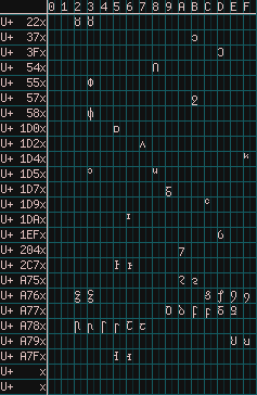 Figure 7.1 Miscellaneous characters required for Østendūnska and
Sadunayitu.
Figure 7.1 Miscellaneous characters required for Østendūnska and
Sadunayitu.
|
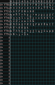 Figure 7.2 Adorable bitmap versions of this magic script.
|
 Figure 7.3 Liturgical Lilhian glyphs mapped to Nüshu's codepoints.
|
What I didn’t expect was that there are already glyphs in the f700 range of Cozette. I can only assume this is due to
Nerd Fonts’
previous allocation
for Material Design. This doesn’t matter to me, as I am
using Cozette rather outside of its designed use-case of terminals and the like.
Basically, I have no intention of contributing to Cozette as an open source
project, at least not at the moment, as I do not use it how it was designed to
be used. So I’m going to shove whatever weird glyphs I want wherever I want on
my fork.
Now, I’ve never used FontForge to make a bitmap font before, so I don’t really know what I’m doing wrong. My .ttf files all seem to be missing the glyphs, you see. Luckily, there is a nice build.py included in the repository. So to run that let’s just…
C:\Cozette> pip install pipenv
'pip' is not recognized as an internal or external command,
operable program or batch file.

C:\Cozette> py -m pip install pipenv
Defaulting to user installation because normal site-packages is not writeable
...
Successfully installed ... pipenv-2025.0.4 ...

C:\Cozette> py -m pipenv install
Warning: Python 3.12 was not found on your system...
Python was not found on your system and neither 'pyenv' nor 'asdf' could be
  found to install Python.

C:\Cozette> py -m pip install pyenv
Collecting pyenv
...
Failed to build pyenv

PS C:\User> Invoke-WebRequest -UseBasicParsing -Uri
  "https://raw.githubusercontent.com/pyenv-win/pyenv-win/master/pyenv-win/install-pyenv-win.ps1"
  -OutFile "./install-pyenv-win.ps1"; &"./install-pyenv-win.ps1"
... cannot be loaded because running scripts is disabled on this system. For more information, see about_Execution_Policies at https://go.microsoft.com/fwlink/?LinkID=135170

PS C:\WINDOWS\system32> Set-ExecutionPolicy -ExecutionPolicy Unrestricted
Execution Policy Change

C:\Cozette> py -m pipenv install
Warning: Python 3.12 was not found on your system...
Would you like us to install CPython 3.12.10 with Pyenv? [y/n] (y): y
...
Successfully created a virtual environment!

C:\Cozette> py -m pipenv run python build.py fonts
...
ImportError: Bad git executable.
Ok, look, on the one hand, why does build.py need git in the first place?
Just to determine directory names? Kind of overkill isn’t it? On the other
hand, why don’t I have git installed even though I’m clearly using a local
clone of a repository? Good question! I forgot to install it and was just using
the GitHub Desktop app like some sort of dweeb.
C:\Cozette> py -m pipenv run python build.py fonts
Building bitmap formates for Cozette...
The filename, directory name, or volume label syntax is incorrect
Why am I doing this in Windows anyway? I don’t have to build the fonts on the same computer I edit them on, yeah? I only don’t use FontForge on my Mac because I don’t like it. I don’t have it installed on my laptop anyway, and it seems the newest version is incompatible with my 2014 MacBook Air. I could try installing it via command line…
➜  Cozette git:(magic) brew install fontforge
...
Error: The following formula cannot be installed from bottle and must be
built from source.
  fontforge
Install the Command Line Tools:
  xcode-select --install

➜  Cozette git:(magic) xcode-select --install
xcode-select: note: install requested for command line developer tools
Would you believe me if I said that I don’t have the disk space for XCode command line developer tools? I have a full 5GB free actually, can I get a “good kitty” in chat? For real, what do I do from here: A) fix the path formatting error to run it on Windows; B) get up from my desk, go to my wife’s desk, log into her Mac Mini which might still have FontForge installed on it,8 then do a bunch of CLI bullshit there; C) try to install FontForge without Homebrew, which requires another third-party application called XQuartz to run; or D) go to bed and deal with this all tomorrow?
Footnotes
-
The MUFI codechart I’m ignoring is Metrical Symbols, which is evidently full of symbols used in texts on Medieval Nordic. ↩︎
-
Also, that thing I said about Oesol was mostly a joke, as I’d also described basing one of my scripts on deconstructed Hangul; if I really wanted Unicode codepoints for that, I’d use the half-width jamo. ↩︎
-
Relevance aside, Unifont is thus far the only font I’ve found to actually cover Sidetic as it was only added in Unicode 17.0 last September. Some antiquarian-type fonts claim they support it, but luckily it’s possible to find out they’re fucking liars before paying them… that’s right, Alphabetum, I’m mad that you claim Sidetic compatibility post-September 2025 while the glyphs are sitting in a PUA at
F240-F24B! Not to mention there being a whole section on Anatolian scripts in the manual, yet Sidetic is only mentioned while listing the others! I had to copy the glyphs from the comparison chart to get their codepoints just to be able to track this all down in the chart; so, yes, I’m just a smidge salty. ↩︎ -
The phonemes described here are for Beleriand mode. ↩︎
-
The SVG doesn’t show the diacritic meant to represent the ears of the cat, which distinguished both /m/ and its voiceless form more clearly from /v/. ↩︎
-
Wow, this table shows the glyphs I designed! That’s a lot of SVGs (56, to be exact)! ↩︎
-
I changed the monospace font on the site from M+1M and M+1 to D2Coding Ligature, because the spaces were wider than the characters and that went away if I fell back onto just M+1 but it was just way too large? Anyway, I probably could have updated to M+1 Code which would also alleviate this, but Naver’s D2Coding Ligature is good too. What, did you expect this footnote to have something to do with the legibility of my code? It’s a programming language not a human language. ↩︎
-
My wife, whom I love, never has any fucking disk space, so whenever I use her computer I just purge anything I left on there to free up space. ↩︎